LUSTRE is the first SEC qualified alternative investment platform that empowers everyone to invest in luxury assets. LUSTRE partners with the world’s premium brands to unlock fractional ownership in high jewelry, ethically sourced precious gems, rare timepieces and aspirational assets.
This project is an ongoing website redesign that began after the release of LUSTRE's MVP in July 2022.
01. Original Website
In July 2022, LUSTRE released its MVP and the first iteration of their website, where they prioritized being educational and informational.
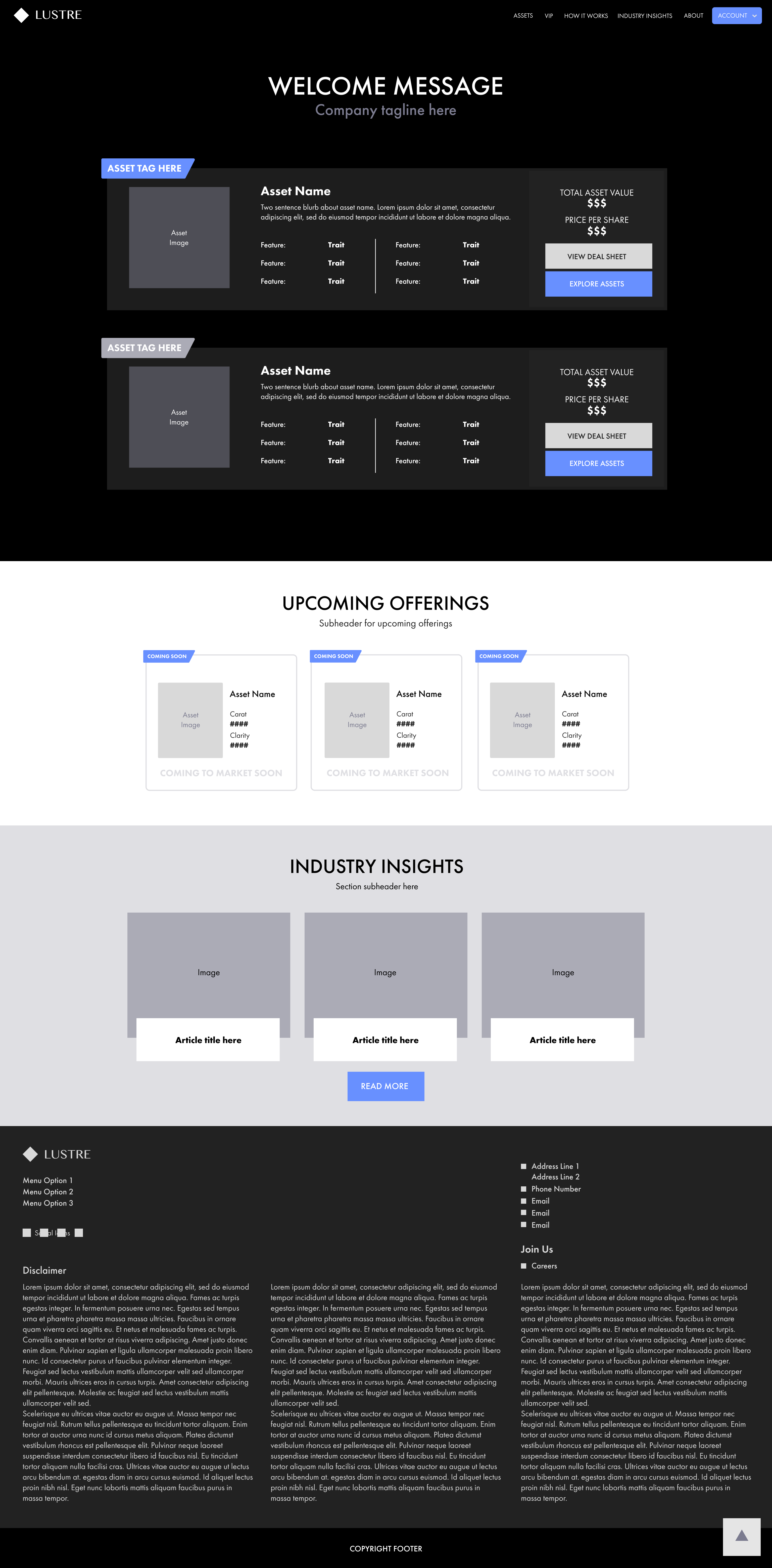
Starting our redesign process, we went through the original website, shown below, and analyzed pitfalls in the user experience.
On the homepage, the first thing that stood out was that the asset cards were images, which made text blurry. We also noticed that it was far too text-heavy. While it adequately informed viewers about what LUSTRE offers on a technical level, the visuals of the site were lacking, not matching the elegance and vibrancy of our product.
One example of this was in the process page, where we relied on icons instead of images, and also split the text up into too much jargon.
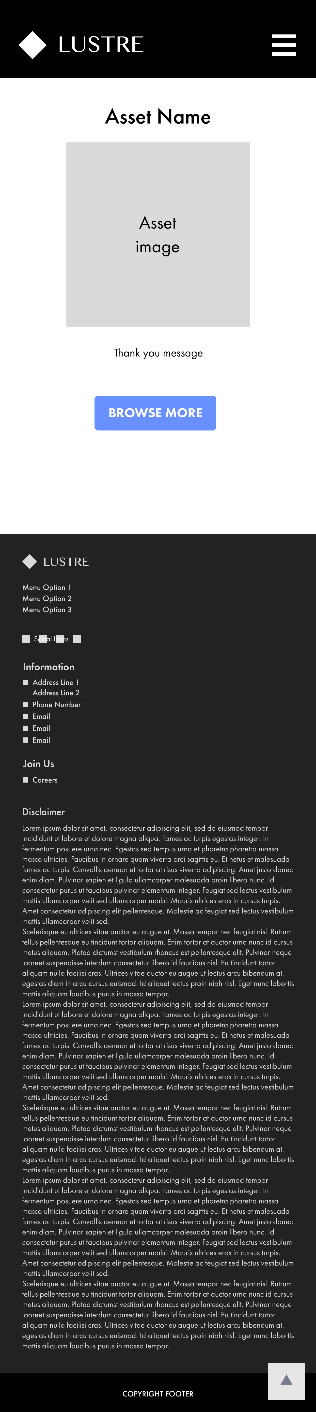
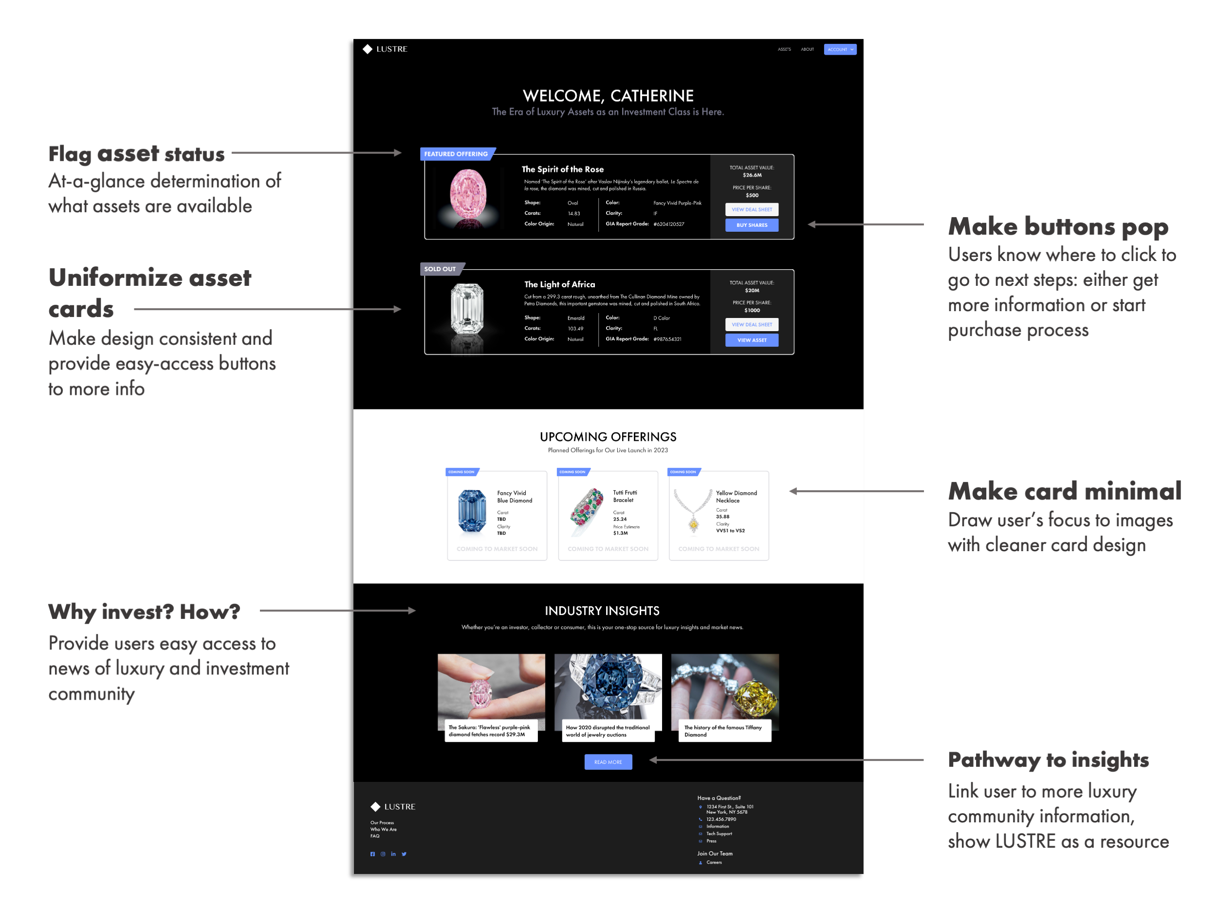
After logging in, one would come face-to-face with the portal dashboard, as seen below. Similarly, it was very text-heavy, with only small image blocks of the offered assets. The paragraph of serif text also looked outdated.
More importantly, however, it was difficult for users to identify where clickpoints were because there were so many blocky elements on the page.
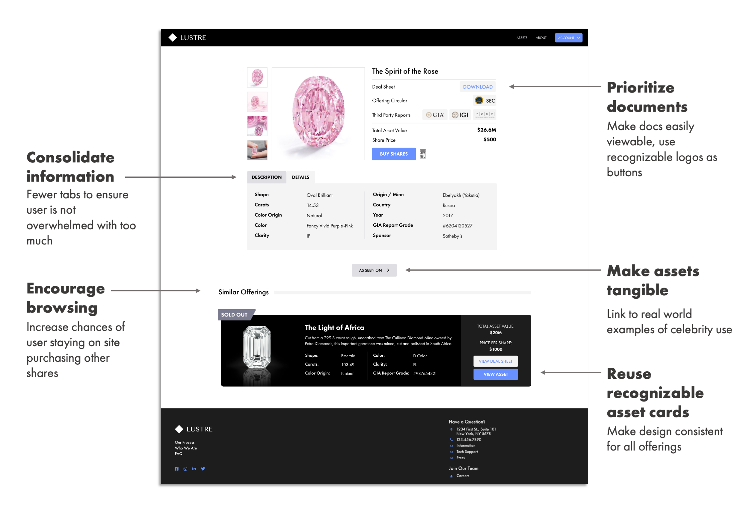
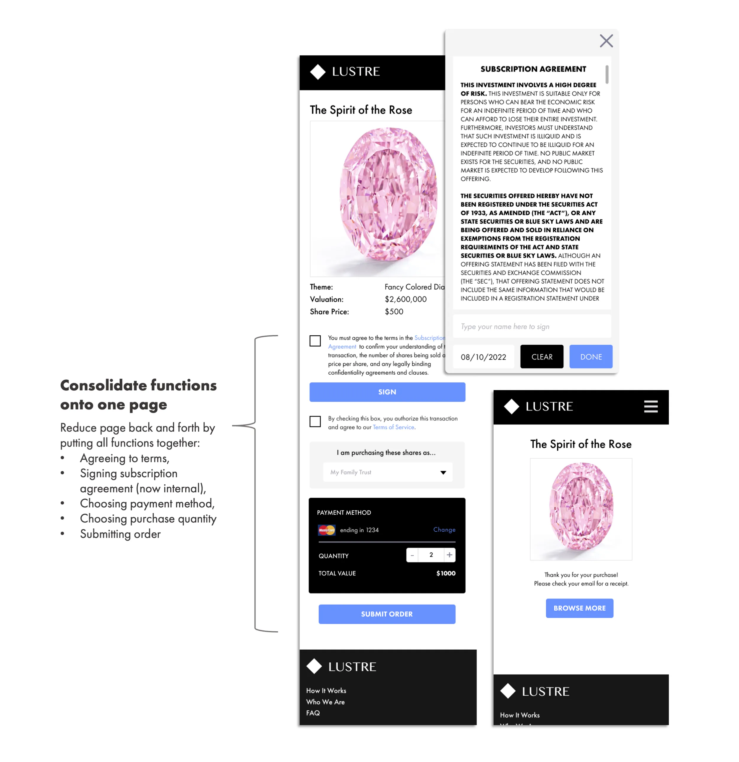
Below are screens depicting the asset cards as well as the purchase flow, both of which were split into too many different tabs and steps. This made it difficult for users to be informed about the asset, and it made the purchase process lengthy and tedious. This was exacerbated further by the e-sign process taking place externally through email.
Another issue was that the site, especially the homepage, was not optimized for mobile.
02. Project Goals
With this analysis, we knew what to focus on for the website redesign:
- Highlight elegance and luxury with images of our assets and other recognizable high jewelry.
- Revamp text to be more eye-catching and understandable to new users.
- Reduce the "blocky" feel of the site by making it more minimal, clean, and modern.
03. Lo-Fi Wireframes
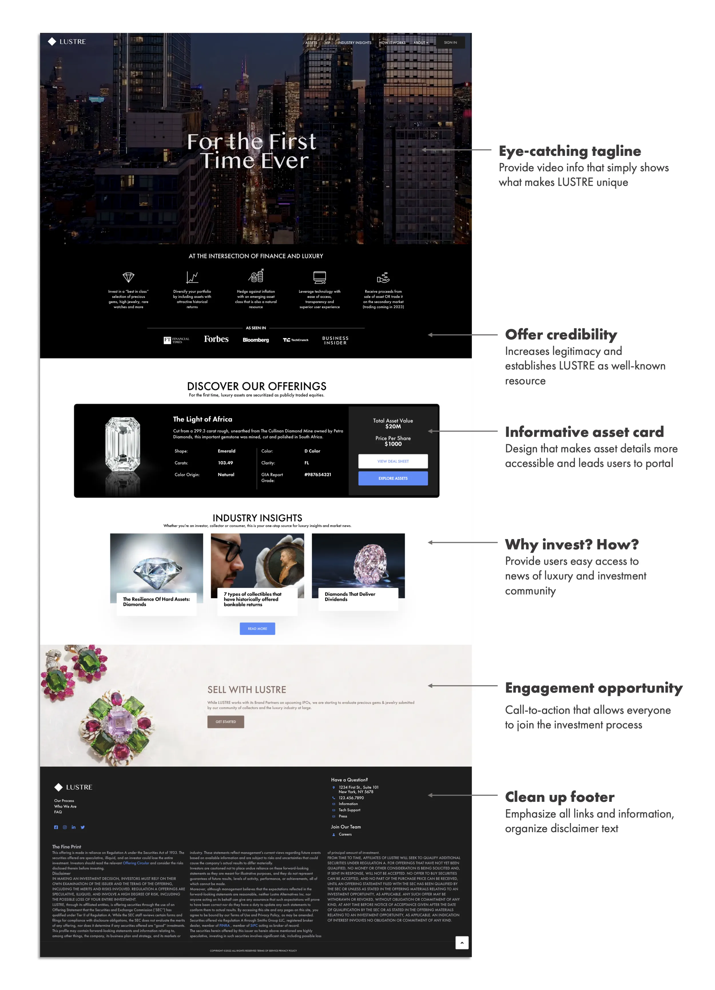
I first used Figma to make lo-fi wireframes. The homepage prioritized a full screen video that would be eye-catching, as well sections that highlighted our assets, explained our process, and provided more knowledge.
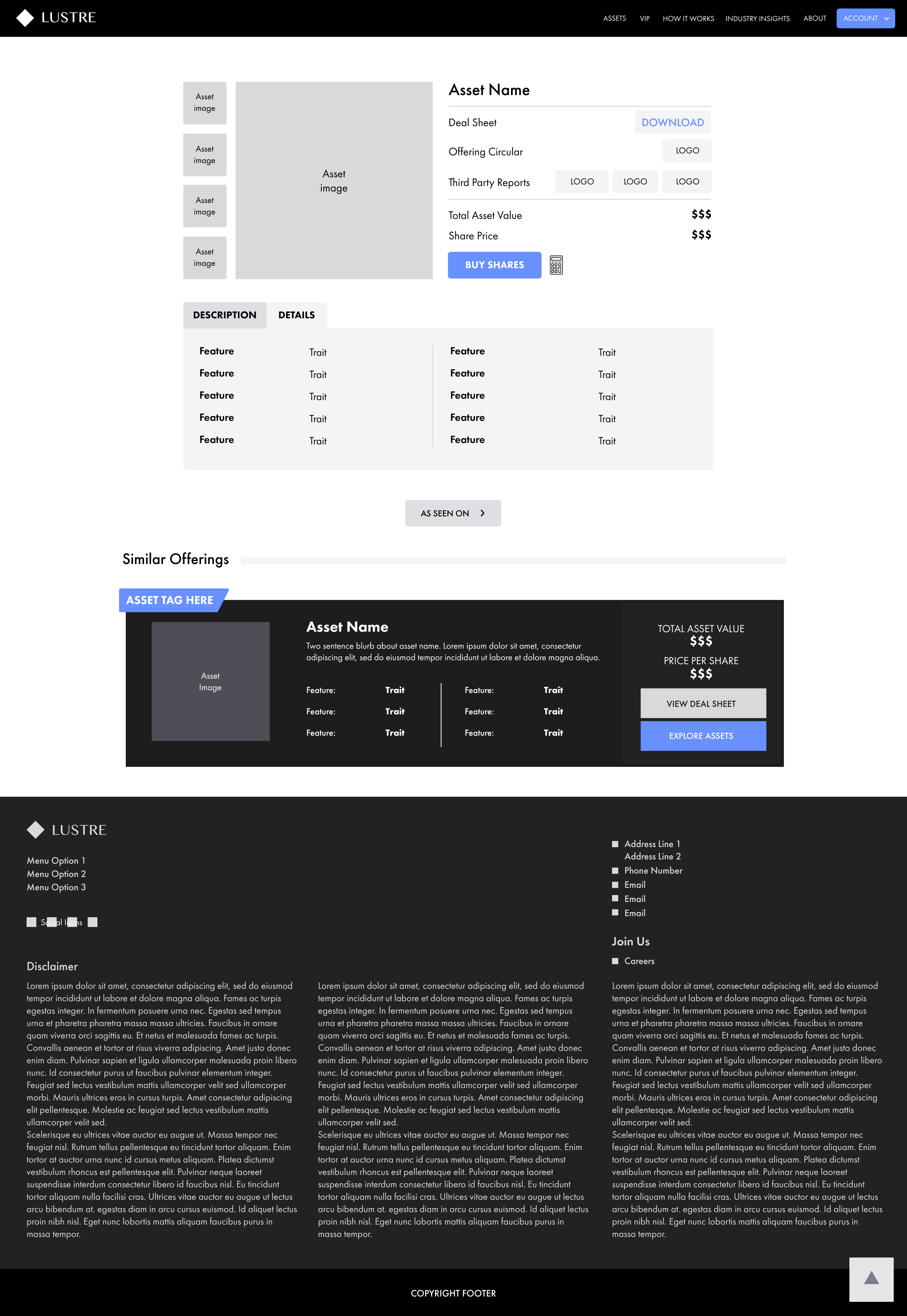
The dashboard one sees upon logging in also underwent an overhaul as I designed a template asset card that could be reused as we scaled up and offered more items.
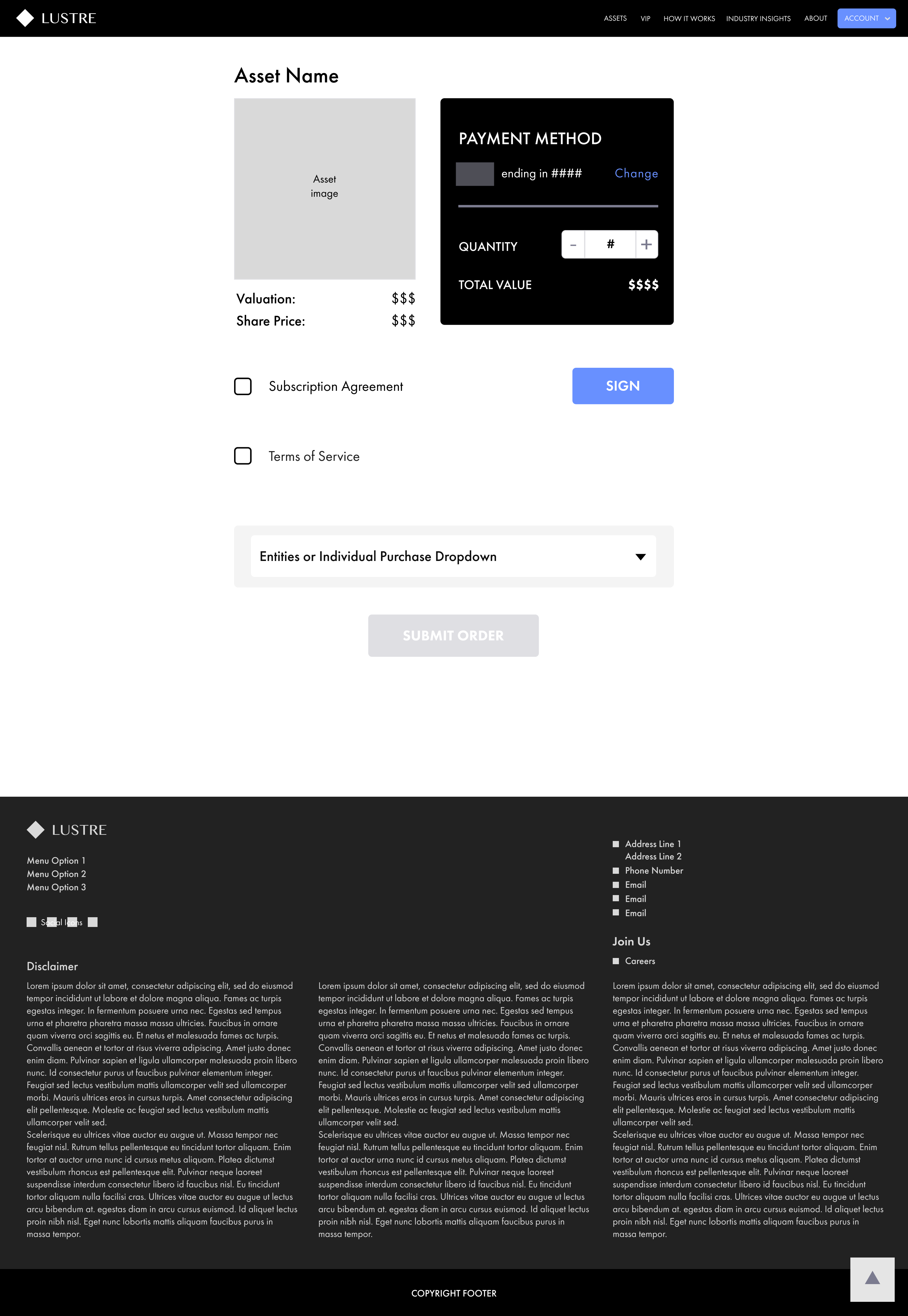
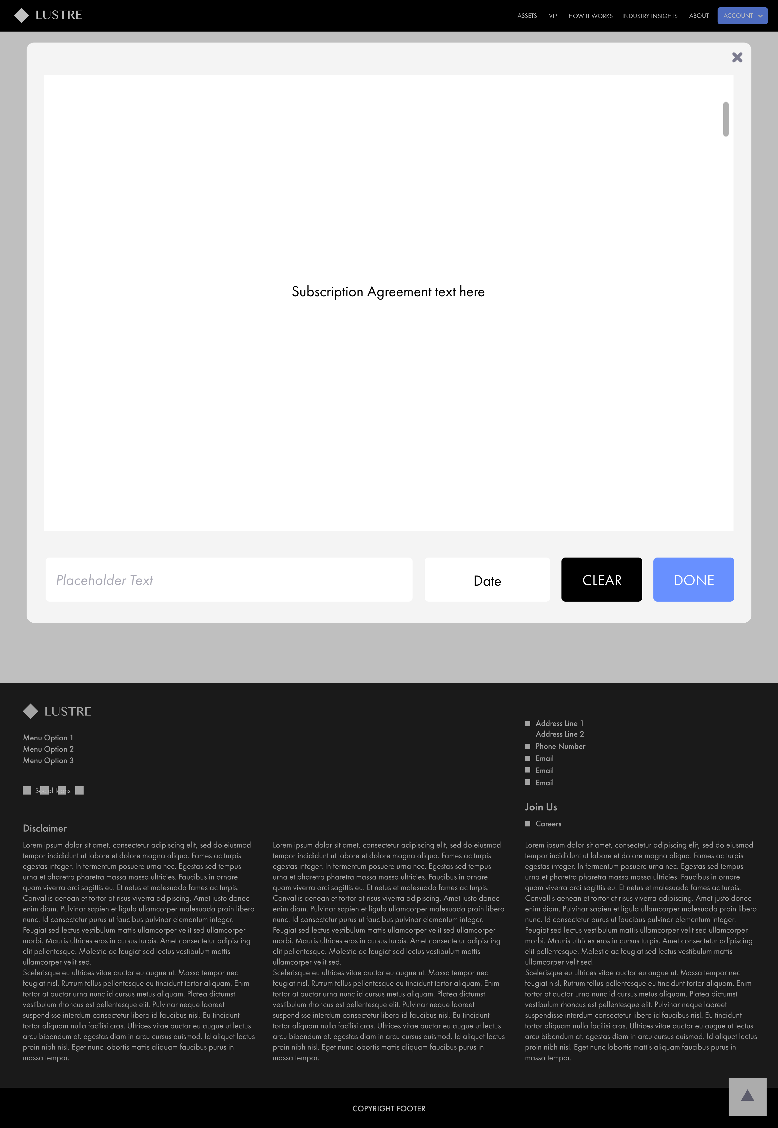
We also massively simplified the asset page tabs and the purchase process, even incorporating our own e-sign function, rather than relying on DocuSign to send them later externally.
We also made sure to wireframe for mobile versions.


04. Further Developments
After being finalized, we experimented more with colors and how to implement our style guide into the site. Further mock-ups for both desktop and mobile were made, shown below.


05. UI Kit
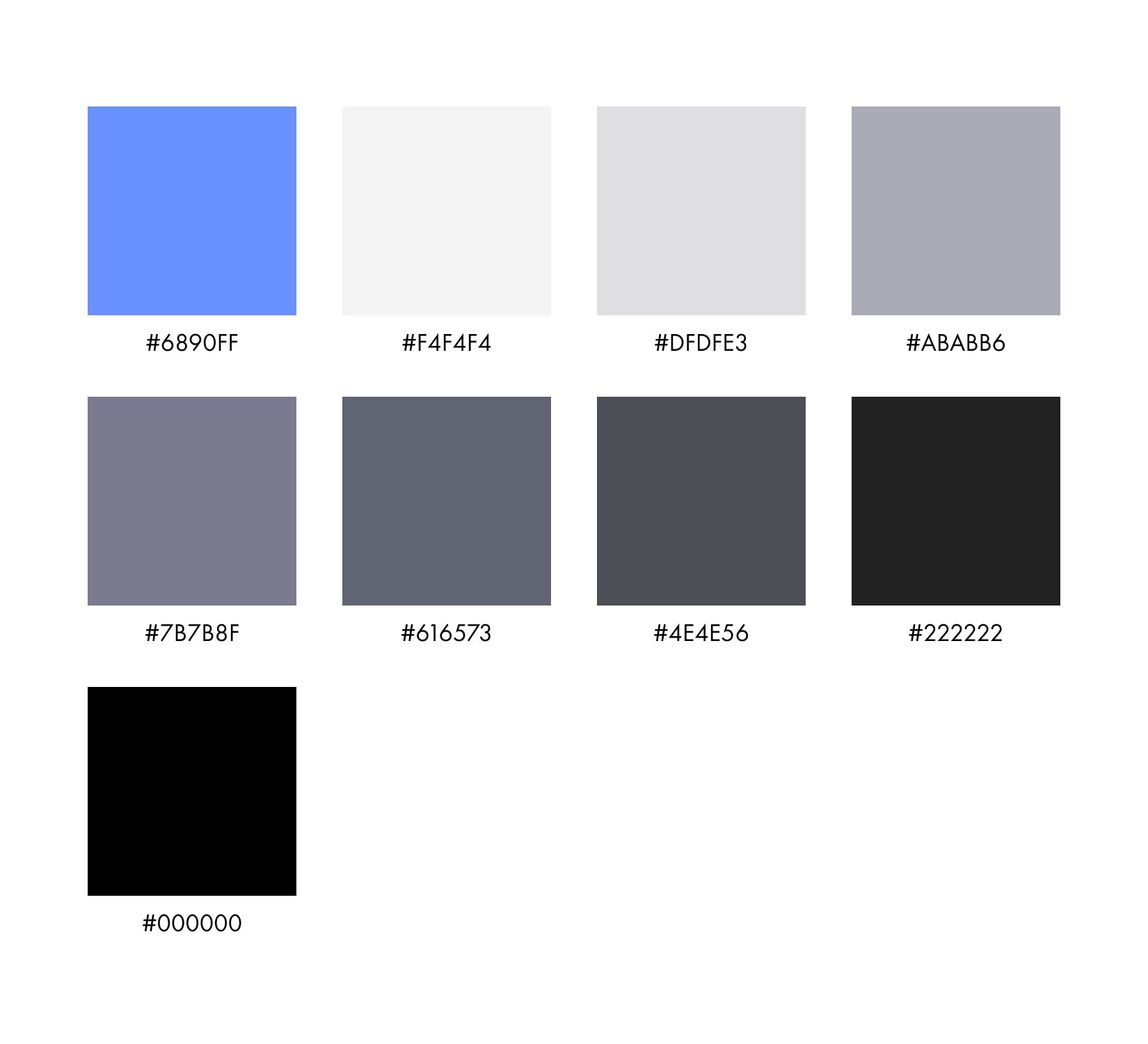
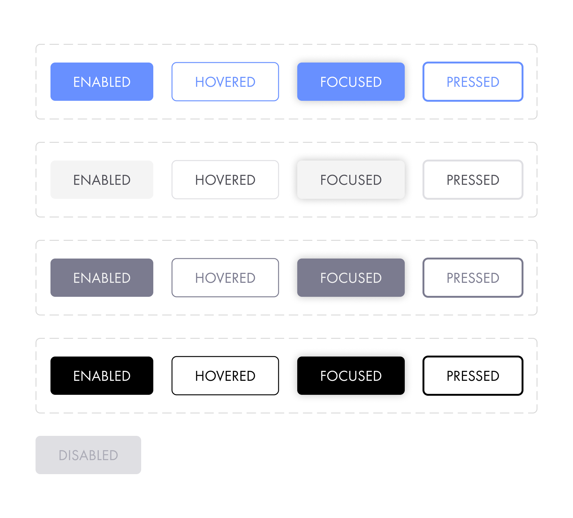
In parallel with the creation of mock-ups, we also began building out a UI kit in Figma with our color schemes, fonts, button and page templates, and more.
06. Hi-Fi Mock-ups Analysis
We then created hi-fi mock-ups to test with users. Our main goal was to focus on luxury images and videos instead of text for users to make visual associations between LUSTRE and other luxury brands and the general feeling of luxury while also making the user flow smoother and more intuitive.
Our analysis was as follows:
07. Implementation
Working with the company's marketing experts and developer team, we implemented our mock-ups. This site is constantly updating with further improvements.
* The name of this brand and some assets has been altered for privacy purposes.
Other Projects

✕
One Golden Moment Podcast Cover
2020 — Photoshop
One Golden Moment was The Daily Californian's sports podcast series, covering everything sports, from providing post-game coverage for all UC Berkeley games to exploring how university and professional sports addressed the COVID-19 pandemic.
As The Daily Californian's internal product designer, I communicated with the editorial and content-creating department to create a cover design that would be bright, inclusive, and timeless.
✕
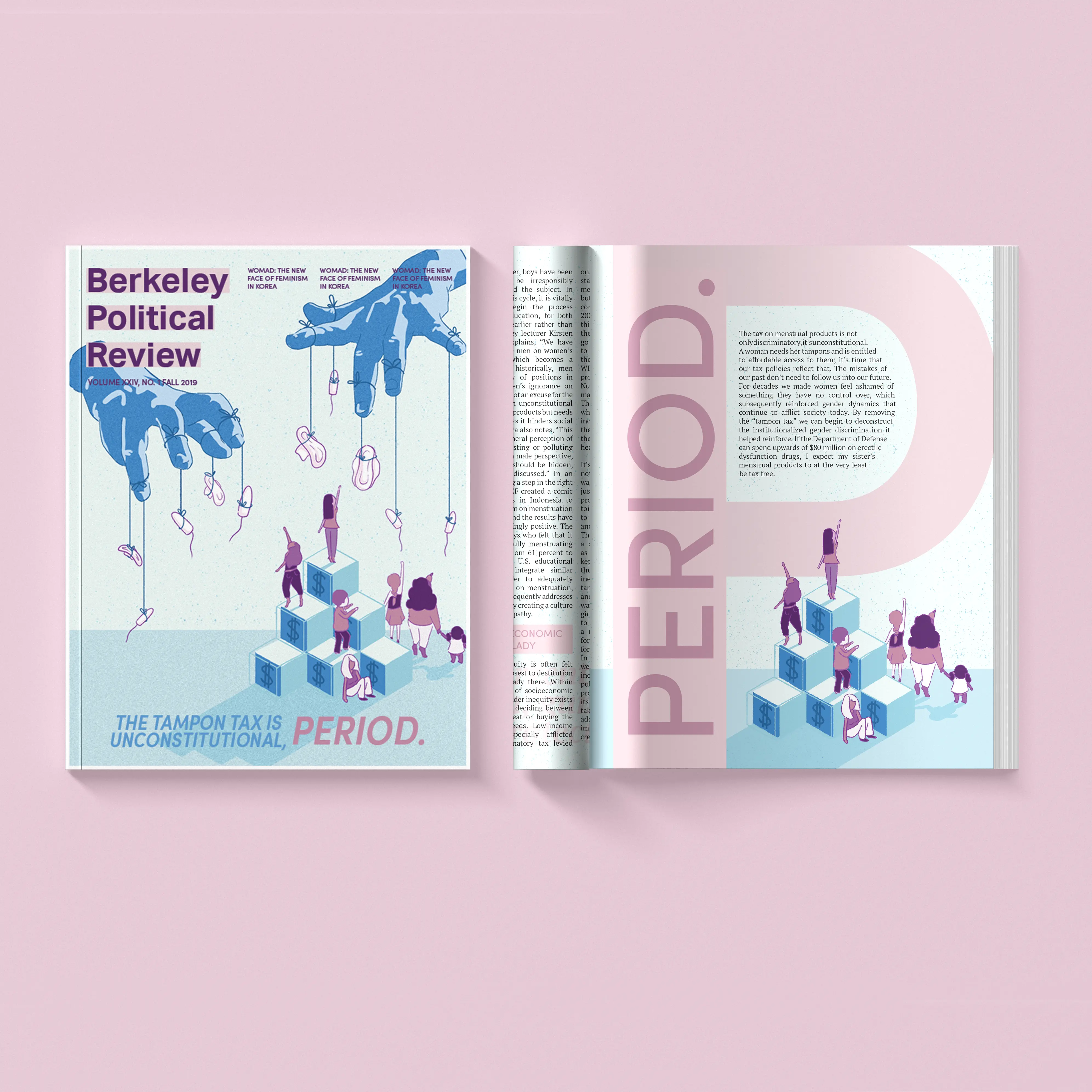
The Tampon Tax Is Unconstitutional, Period.
2019 — Photoshop, InDesign
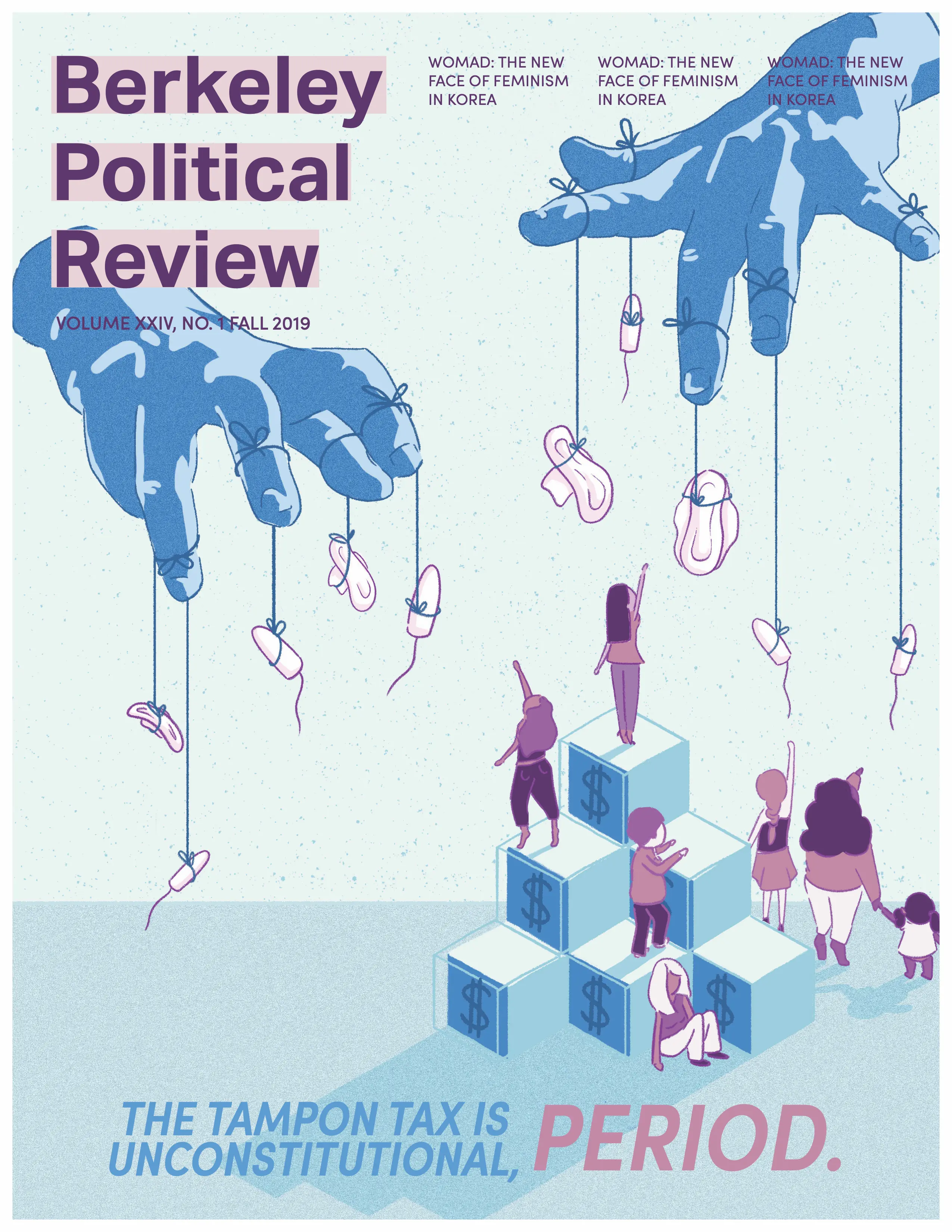
“If the Department of Defense can spend upwards of $80 million on erectile dysfunction drugs, I expect my sister’s menstrual products to at the very least be tax free.”
For this issue of Berkeley Political Review, I wanted to make a cover that told a story. Working with the article author and researching political cartoons and visual metaphors, I illustrated an image of pads and tampons being held out of reach, with stairs to represent financial ability.
In addition to the cover art, I was also responsible for several design spreads. The following articles and pages are my work:
- Cover Art & Pg. 32:The Tampon Tax is Unconstitutional, Period.
- Pg. 12: Obamacare Wasn’t Enough — We Need Medicare For All
- Pg. 58: The Mental State of California’s Prisons