Unithrifts, previously branded College Thrifts, is an all-in-one sustainable college gear platform where users can sell or shop for gently-used, affordable college merchandise, track their carbon footprint, and connect with other students or alumni.
For this project, the client requested a new logo for a new brand name.
01. Previous Branding
Unithrifts was previously branded College Thrifts and used the globe emoji as a logo.
The main color scheme was pastel green and blue, creating a light-hearted and softer atmosphere around the brand.

02. Client Request
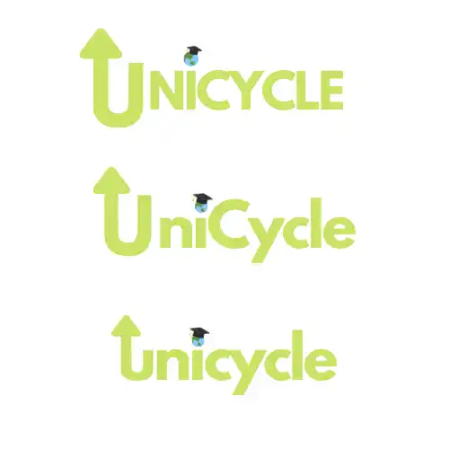
The client first needed a new logo with the text “Unicycle” — a new brand name that was a combination of “university” and “recycle.”
Previous sample logo iterations were shared and there were some things to note:
- Although “unicycle” is a pun, the word’s actual meaning does not have anything to do with the brand — would including it be confusing?
- How can these logos be converted into icons for apps?
After discussion, the three visual symbols that the client felt were the most important to include were as follows:
- Arrow, to represent recycling and reuse
- Earth, to represent sustainability and life
- Graduation Cap, or another college symbol to represent students
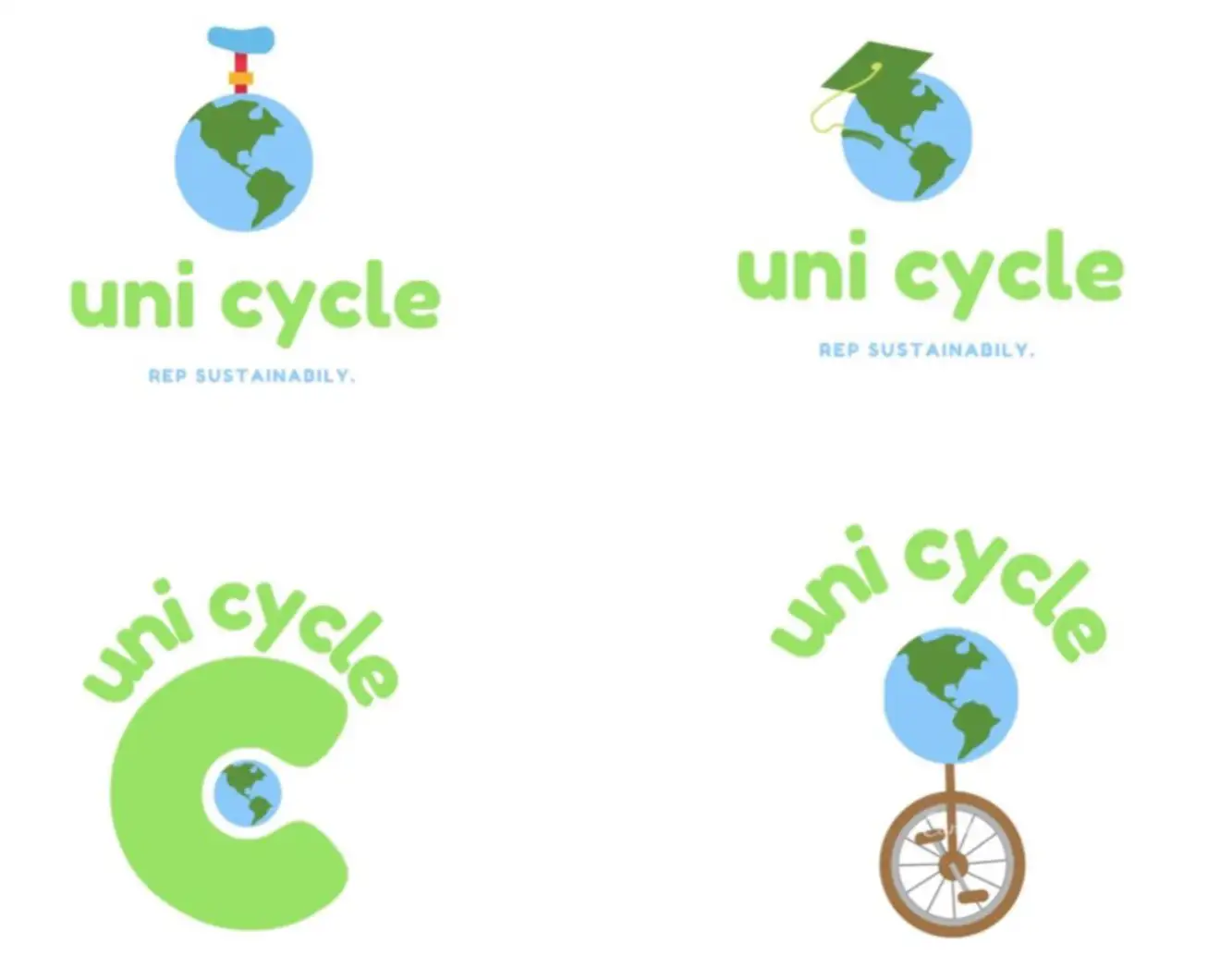


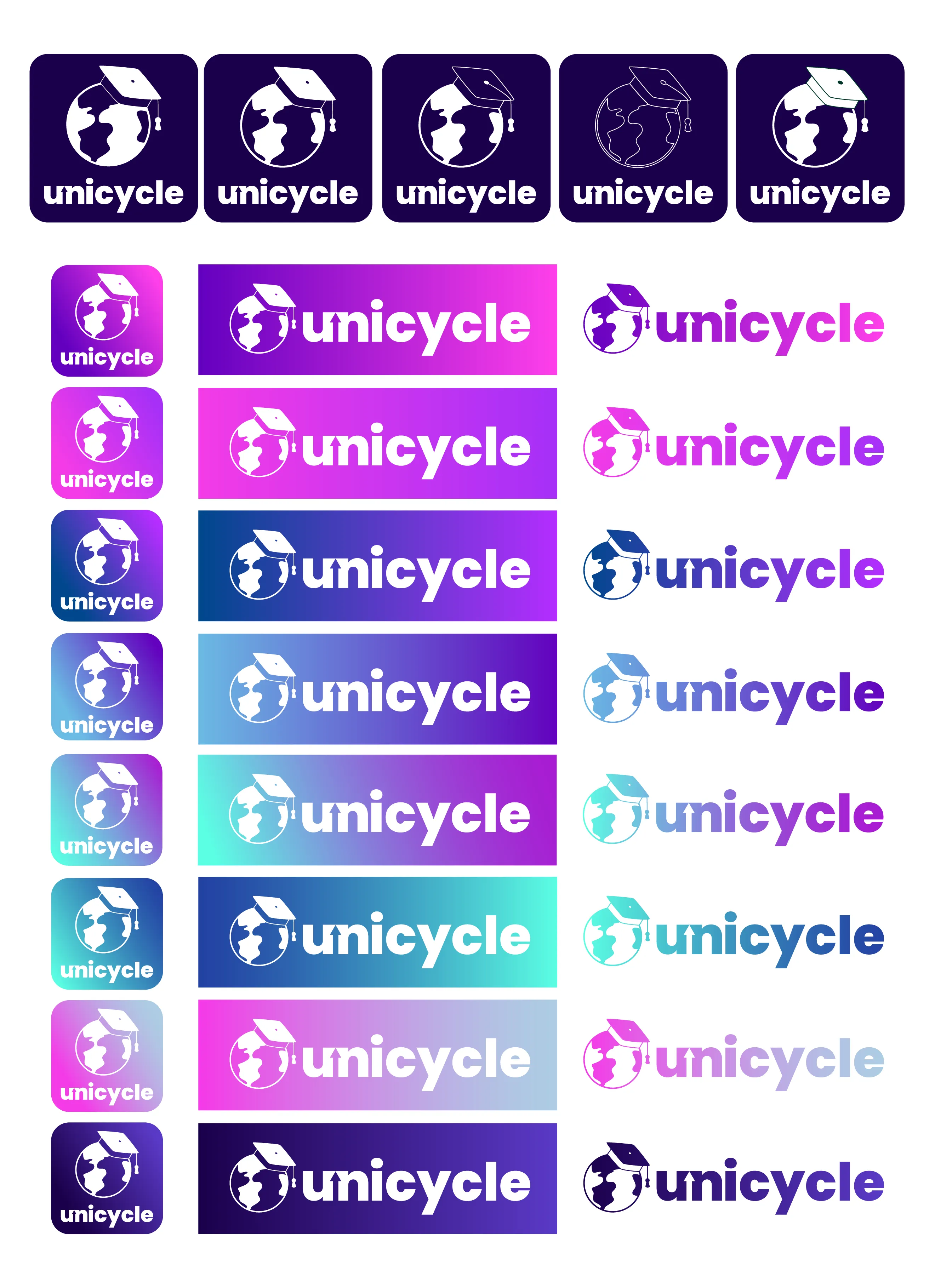
03. First Drafts
For the first few drafts, we experimented with different styles of logos, producing 3 different logo sets each with a roughly different aesthetic.
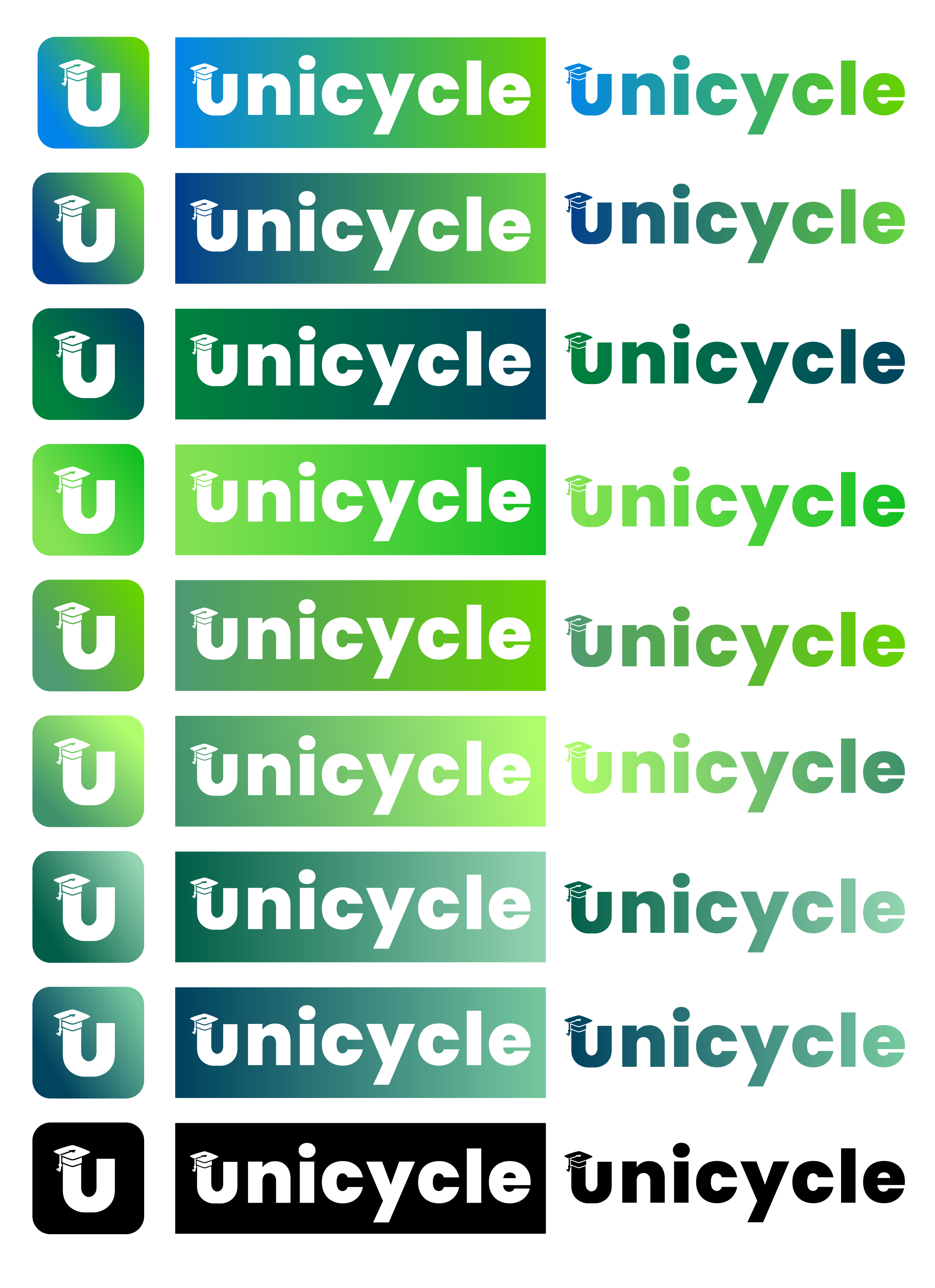
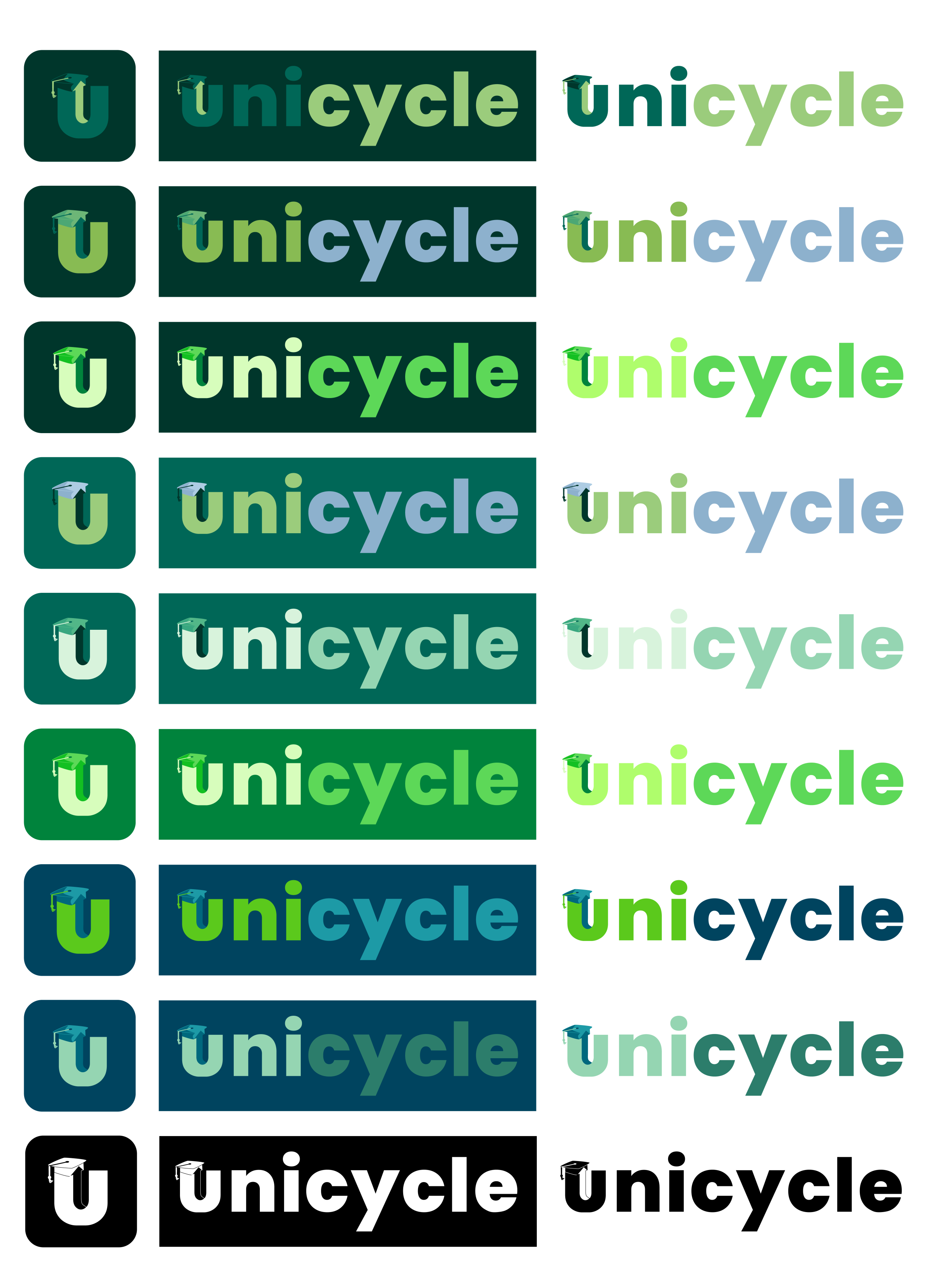
The first set was more modern, bold, and vivid.
The second set used colors similar to College Thrift’s existing scheme and was more soft, relaxing, and harmonious.
The third used more solid colors and found a middle ground that was playful, recognizable, and confident.
We noticed that it was difficult to balance minimalism with all the symbols they wanted to be included, but a few rounds of feedback allowed me to get a better idea of what aesthetic direction they preferred: a logo that was much brighter and more vivid than their original branding.
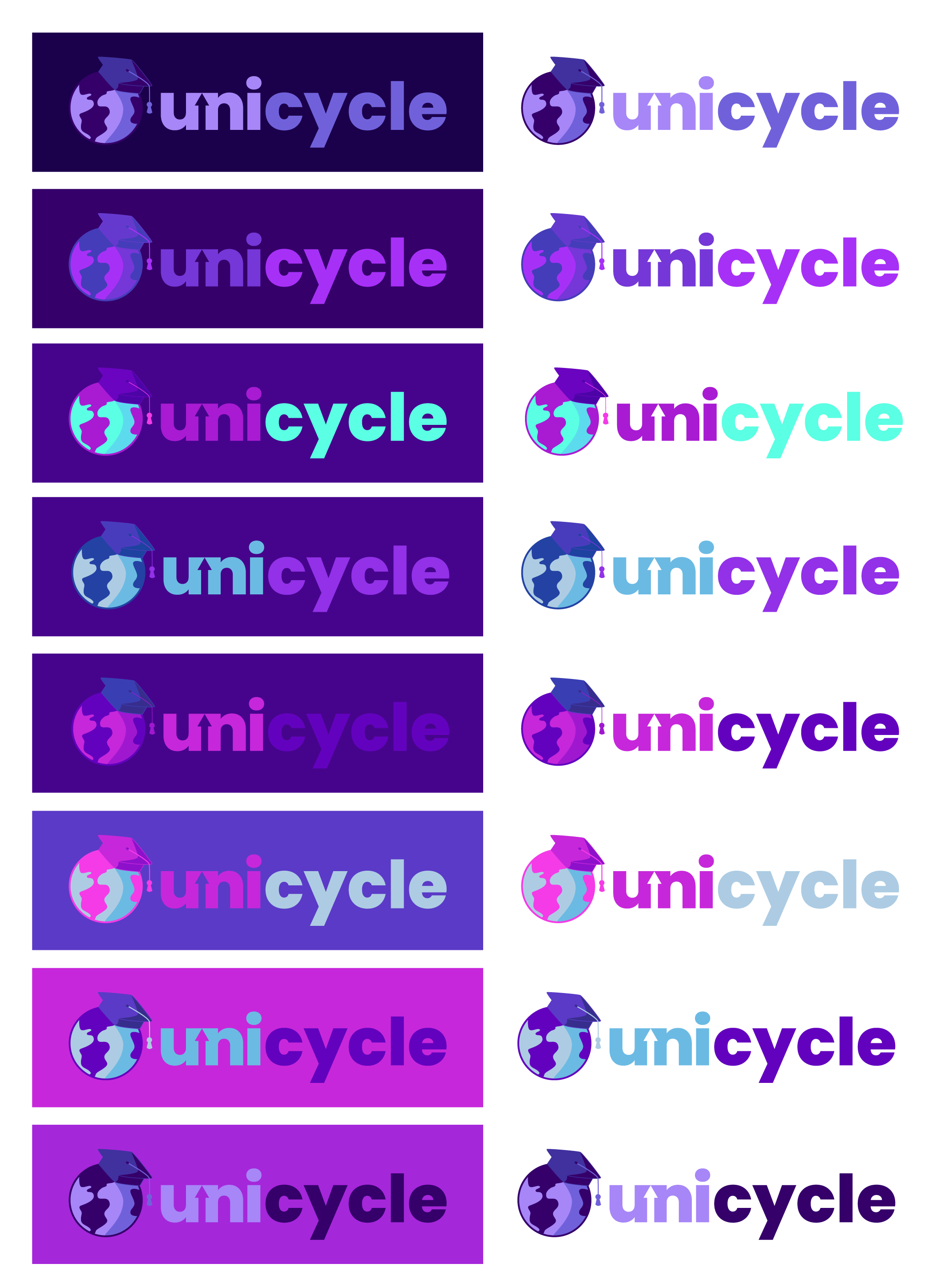
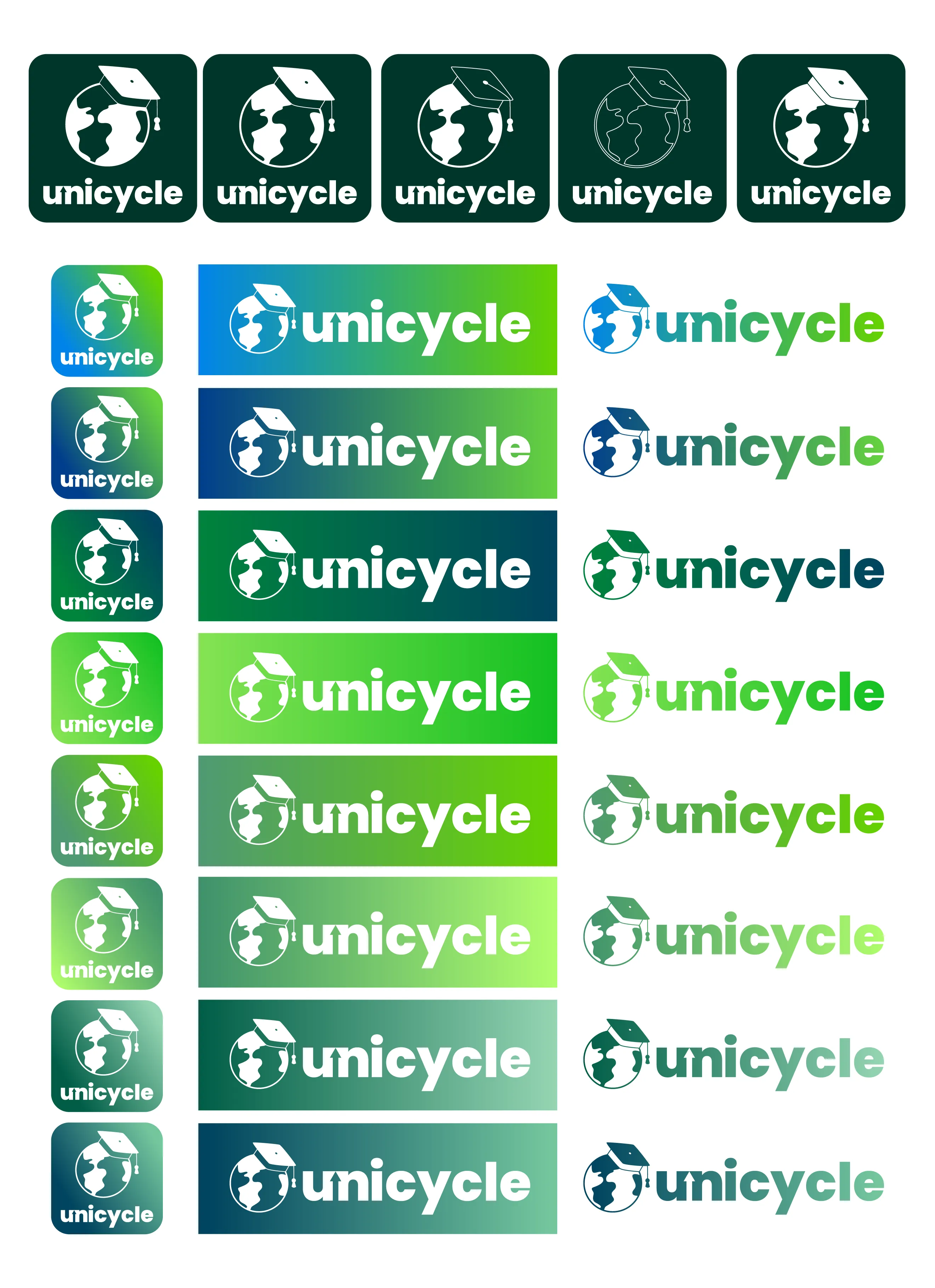
04. Color Schemes
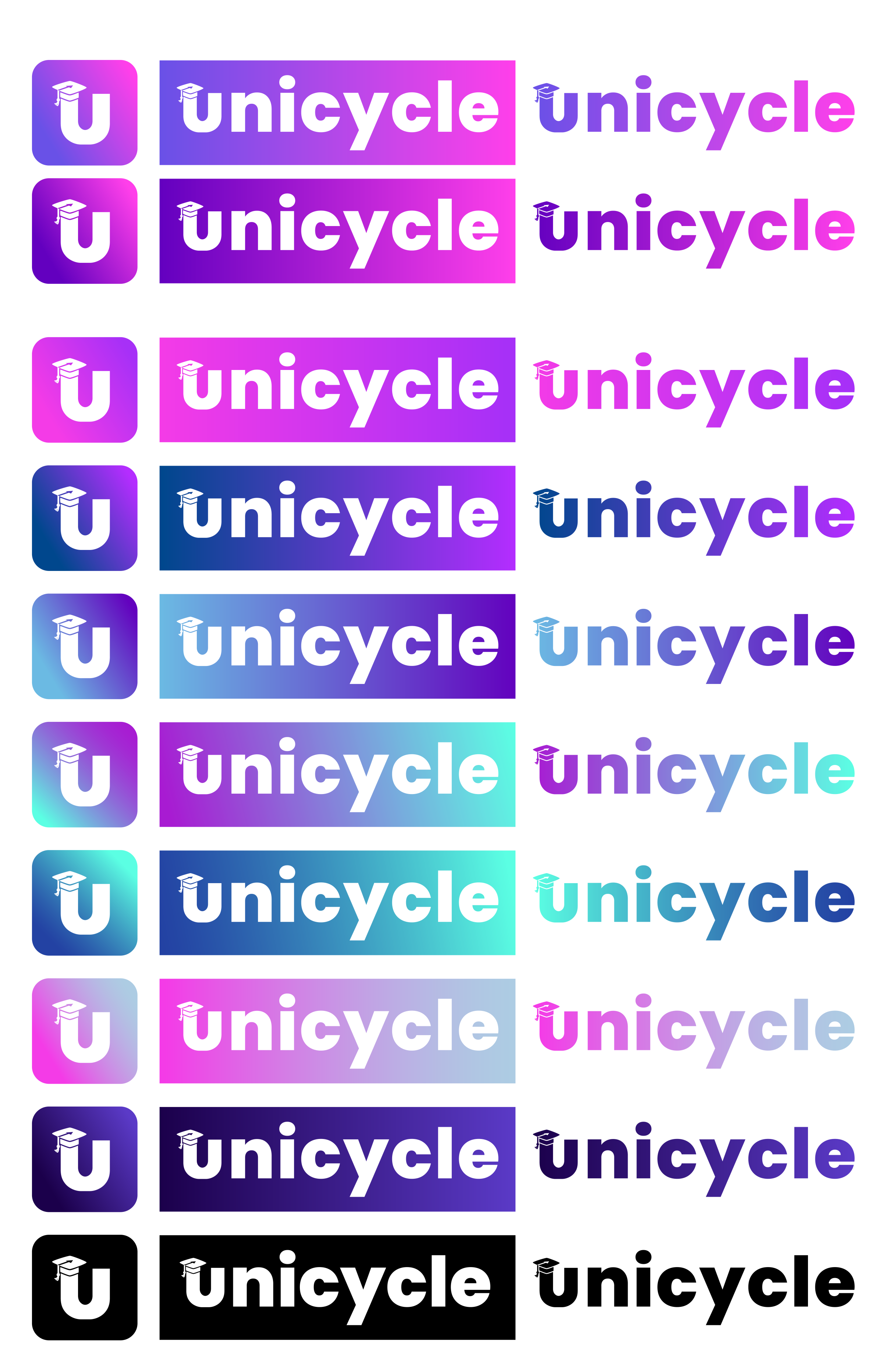
Deciding altogether to move away from the periwinkle/mint colors of the previous logo, we tested different gradients with a more minimalist design.
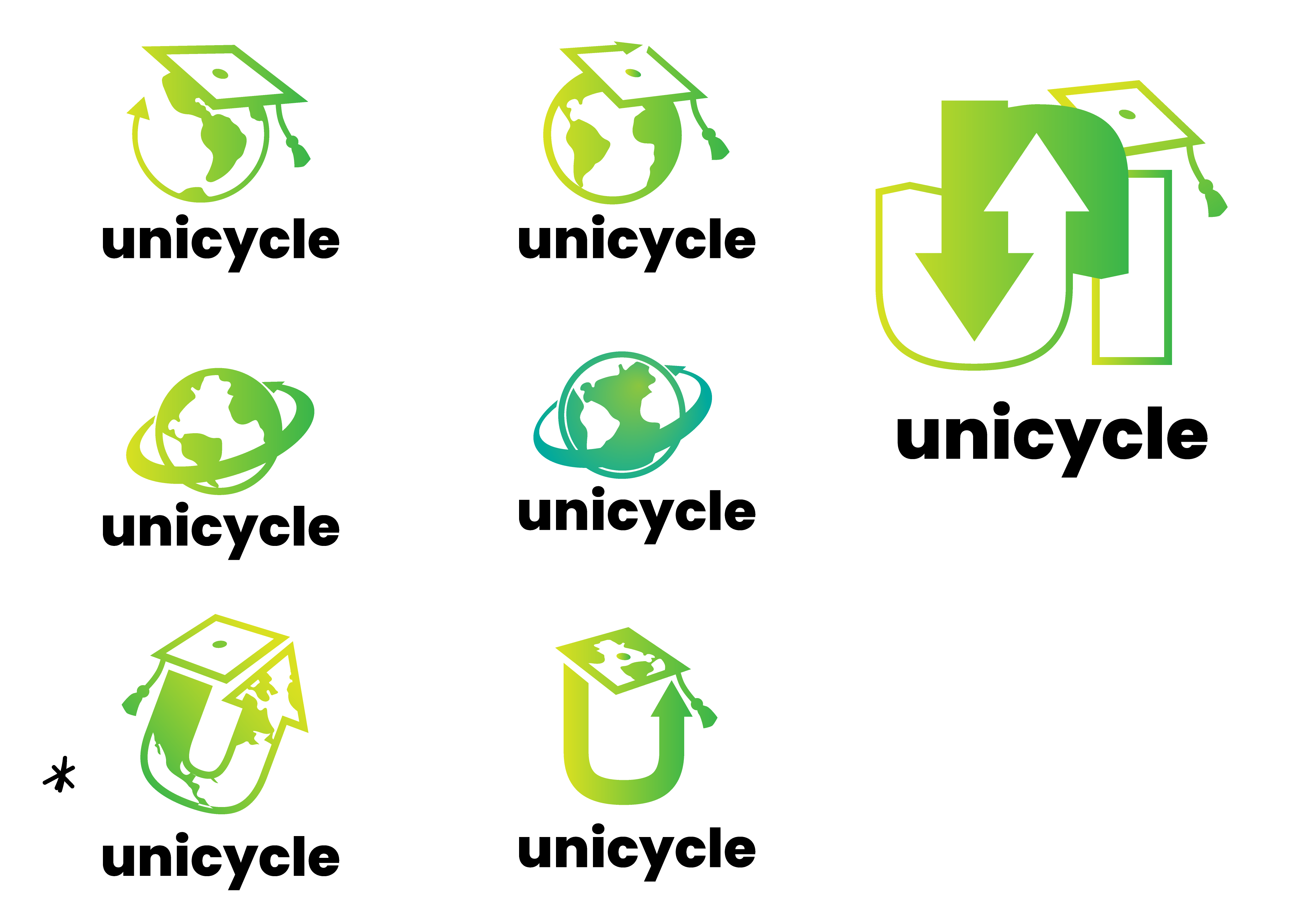
05. Second Drafts
The client narrowed down their options to two: green and purple, so the next step was to try out different variations of the logo in different shades of these colors, going further with the solid and gradient logo iterations we had dabbled in before.
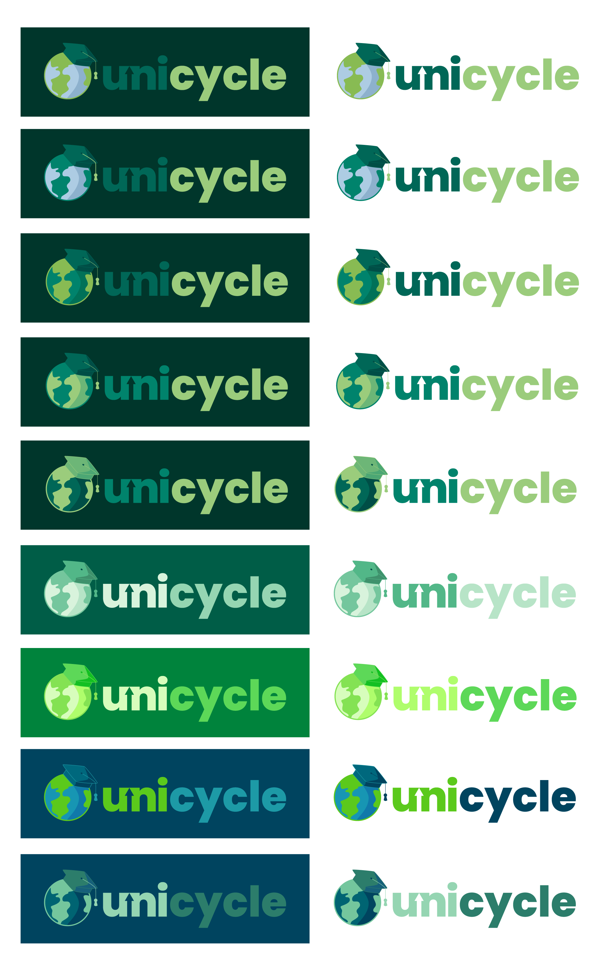
06. Third Drafts
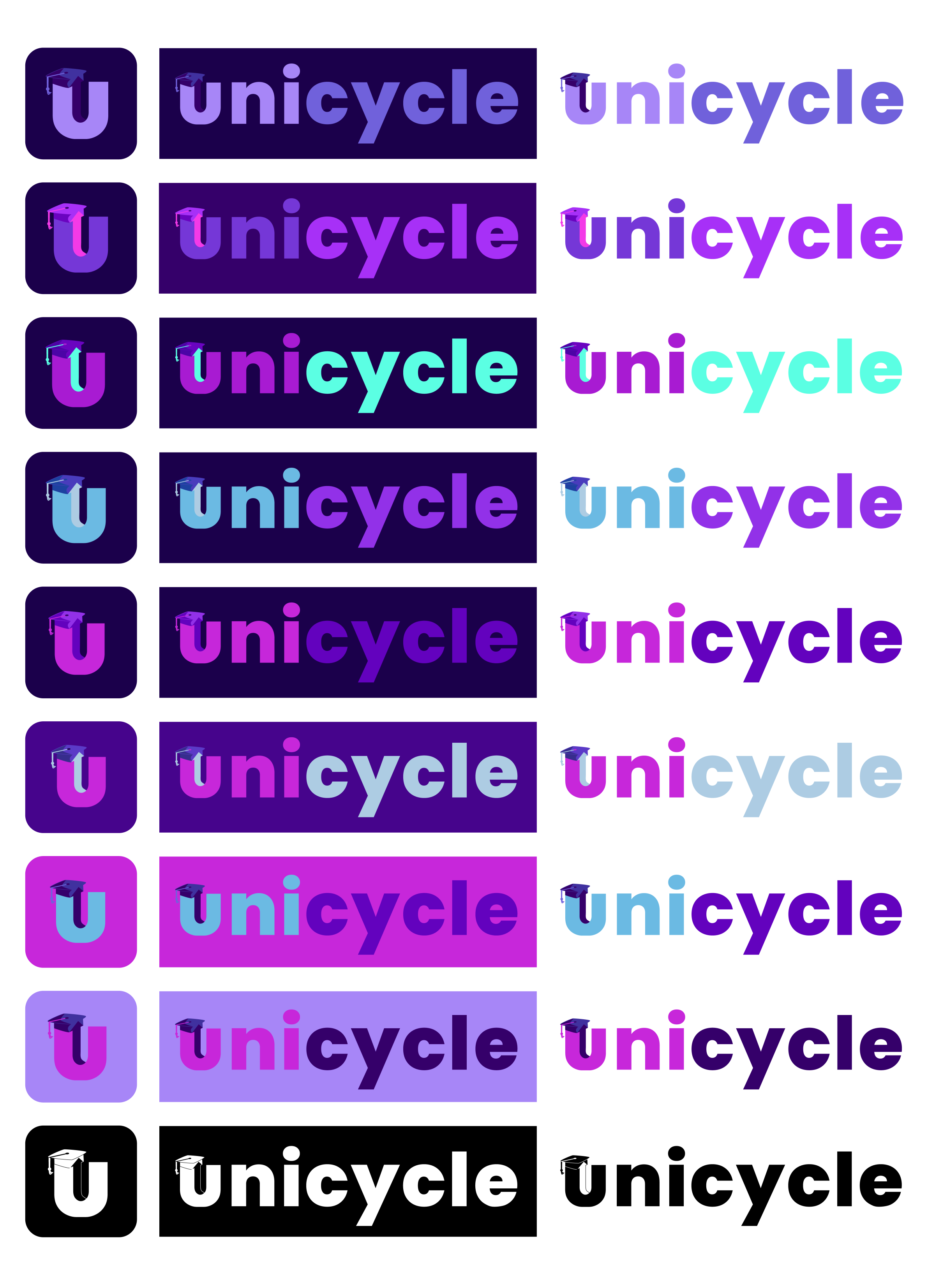
As the logo was developed further, the decision was made to either drop the earth icon entirely or make it less obvious, since there were already a plethora of other organizations out there using it in their logo and would be very on-the-nose.
Instead, we focused on the “U” icon and how to incorporate other symbols within it. Both flat shades and gradient designs were tested out with this format.
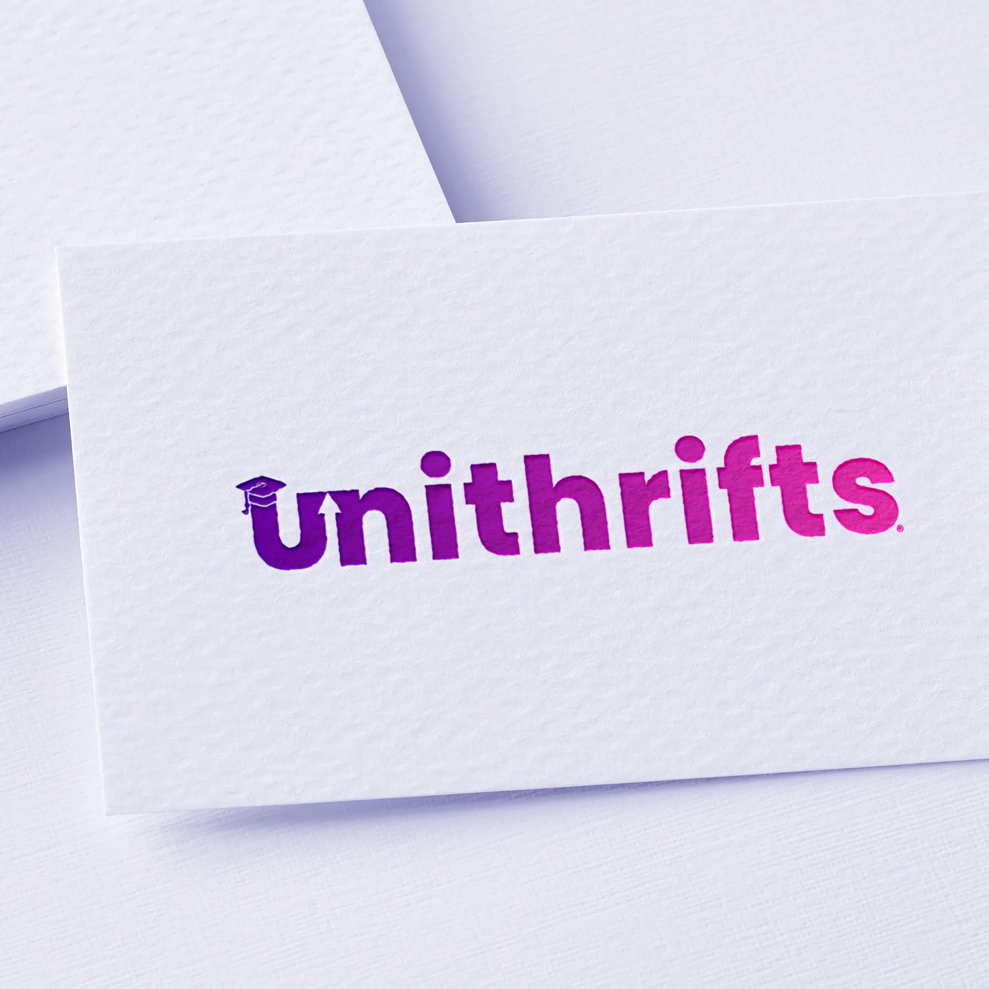
07. Final Design
The final chosen design was a purple-pink gradient, with all aforementioned symbols included — even the earth, which had been reimplemented in a less obvious manner.
The client also changed the name of the brand to "Unithrifts" and different variations were created, along with icons and assets for Facebook, Twitter, YouTube, LinkedIn, and Zoom.


Other Projects

✕
One Golden Moment Podcast Cover
2020 — Photoshop
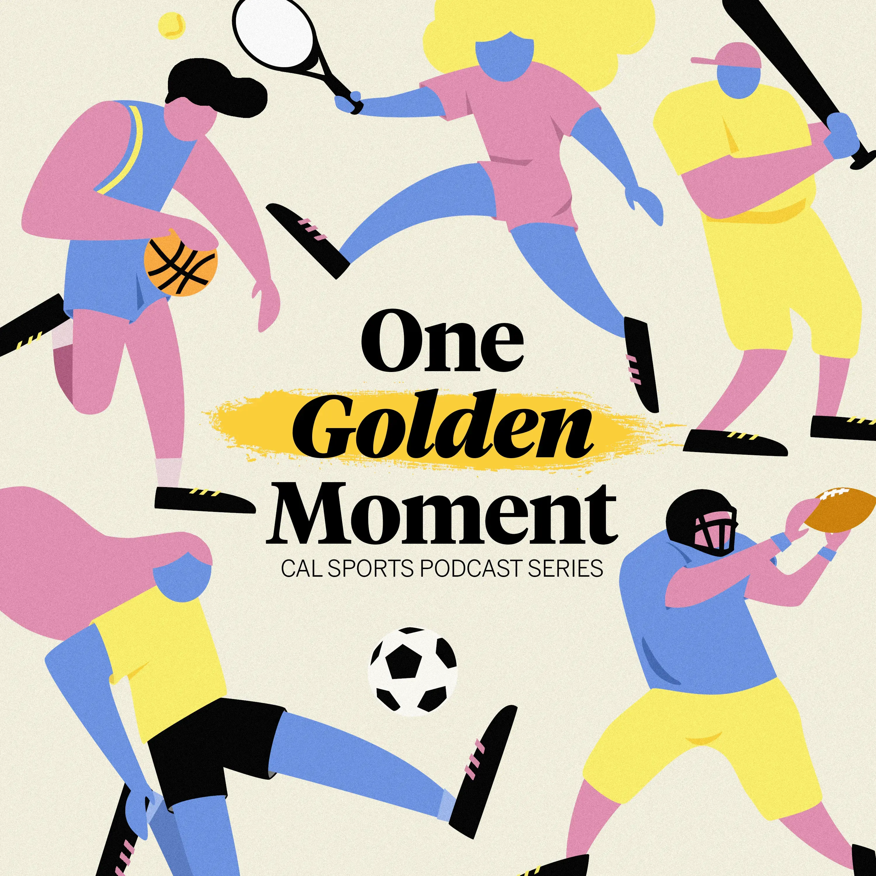
One Golden Moment was The Daily Californian's sports podcast series, covering everything sports, from providing post-game coverage for all UC Berkeley games to exploring how university and professional sports addressed the COVID-19 pandemic.
As The Daily Californian's internal product designer, I communicated with the editorial and content-creating department to create a cover design that would be bright, inclusive, and timeless.
✕
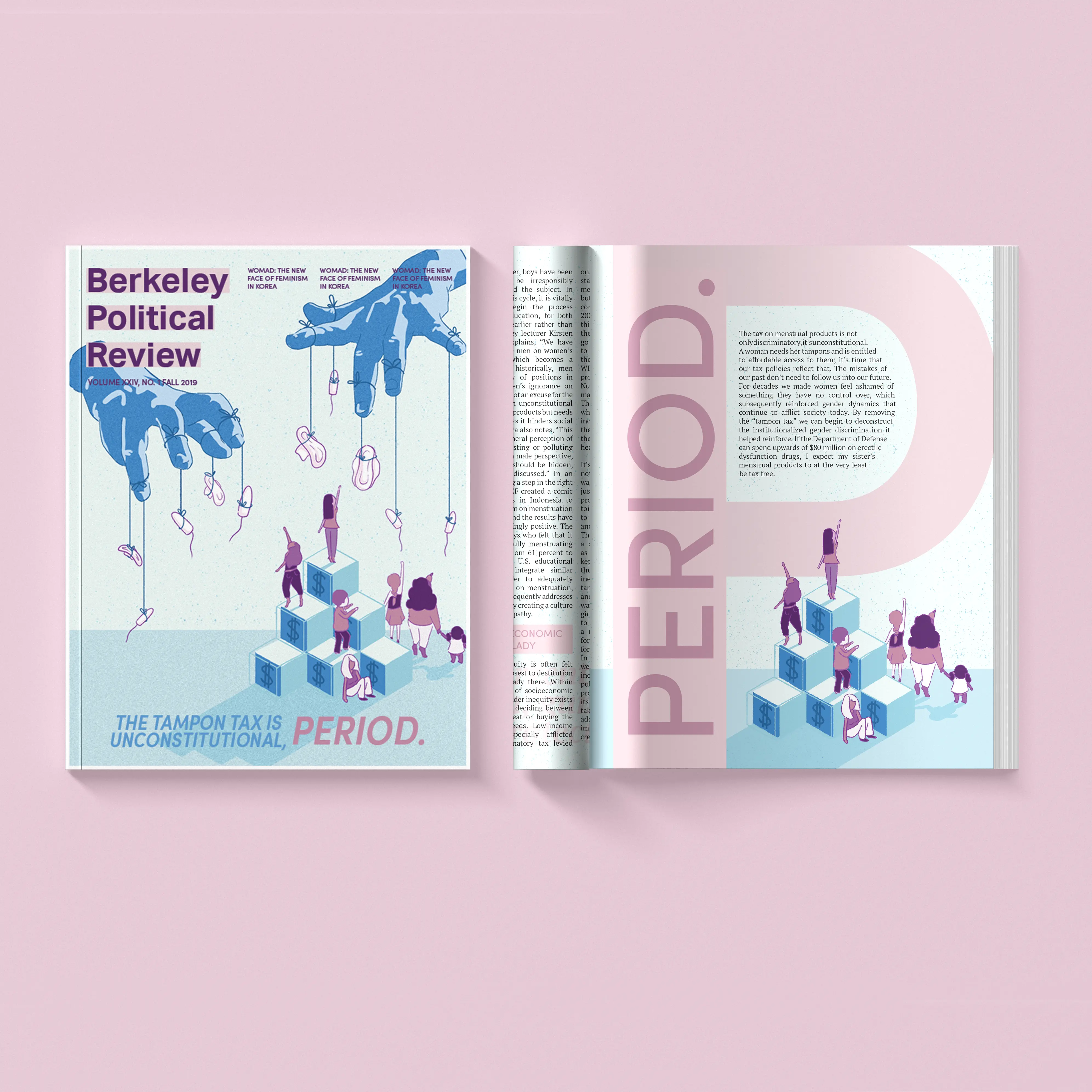
The Tampon Tax Is Unconstitutional, Period.
2019 — Photoshop, InDesign
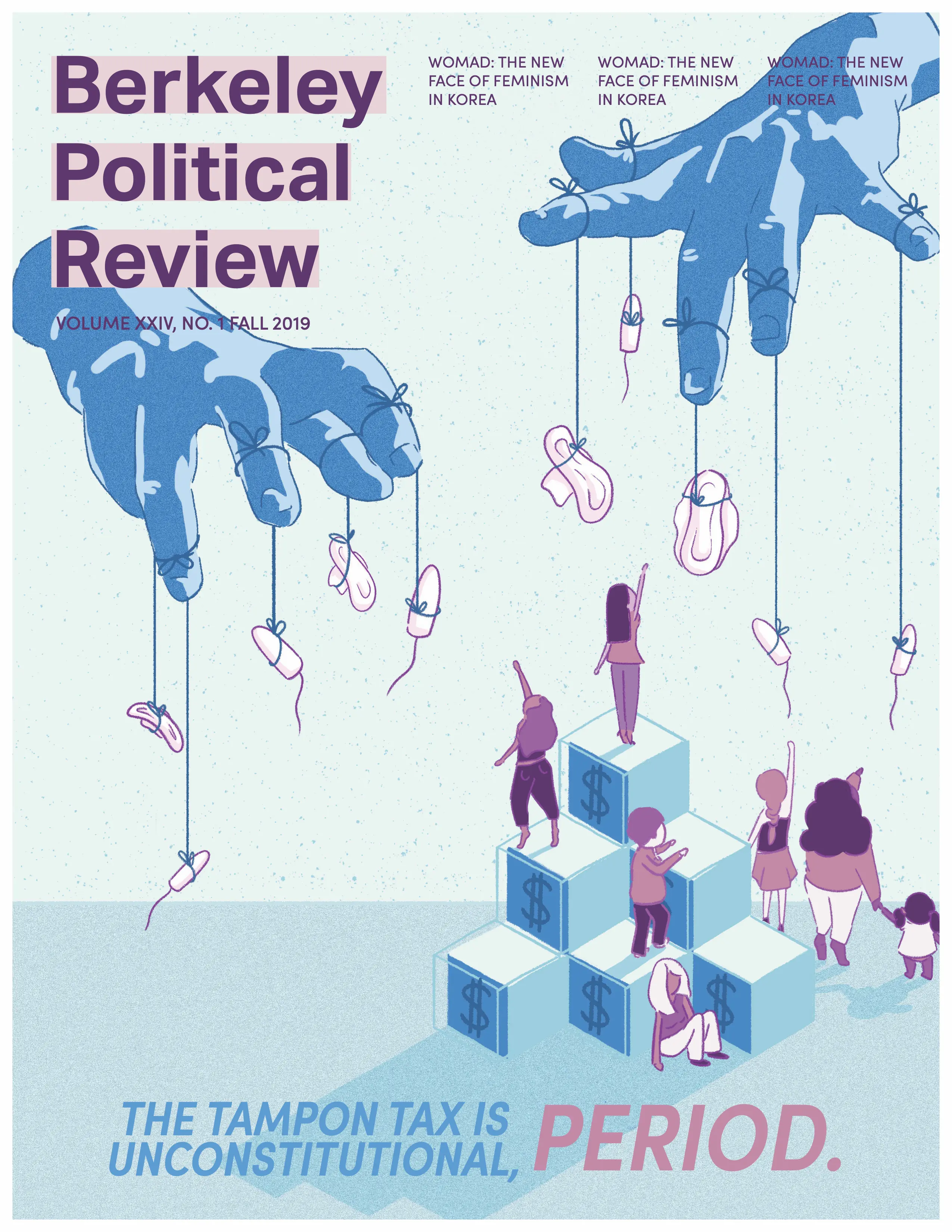
“If the Department of Defense can spend upwards of $80 million on erectile dysfunction drugs, I expect my sister’s menstrual products to at the very least be tax free.”
For this issue of Berkeley Political Review, I wanted to make a cover that told a story. Working with the article author and researching political cartoons and visual metaphors, I illustrated an image of pads and tampons being held out of reach, with stairs to represent financial ability.
In addition to the cover art, I was also responsible for several design spreads. The following articles and pages are my work:
- Cover Art & Pg. 32:The Tampon Tax is Unconstitutional, Period.
- Pg. 12: Obamacare Wasn’t Enough — We Need Medicare For All
- Pg. 58: The Mental State of California’s Prisons