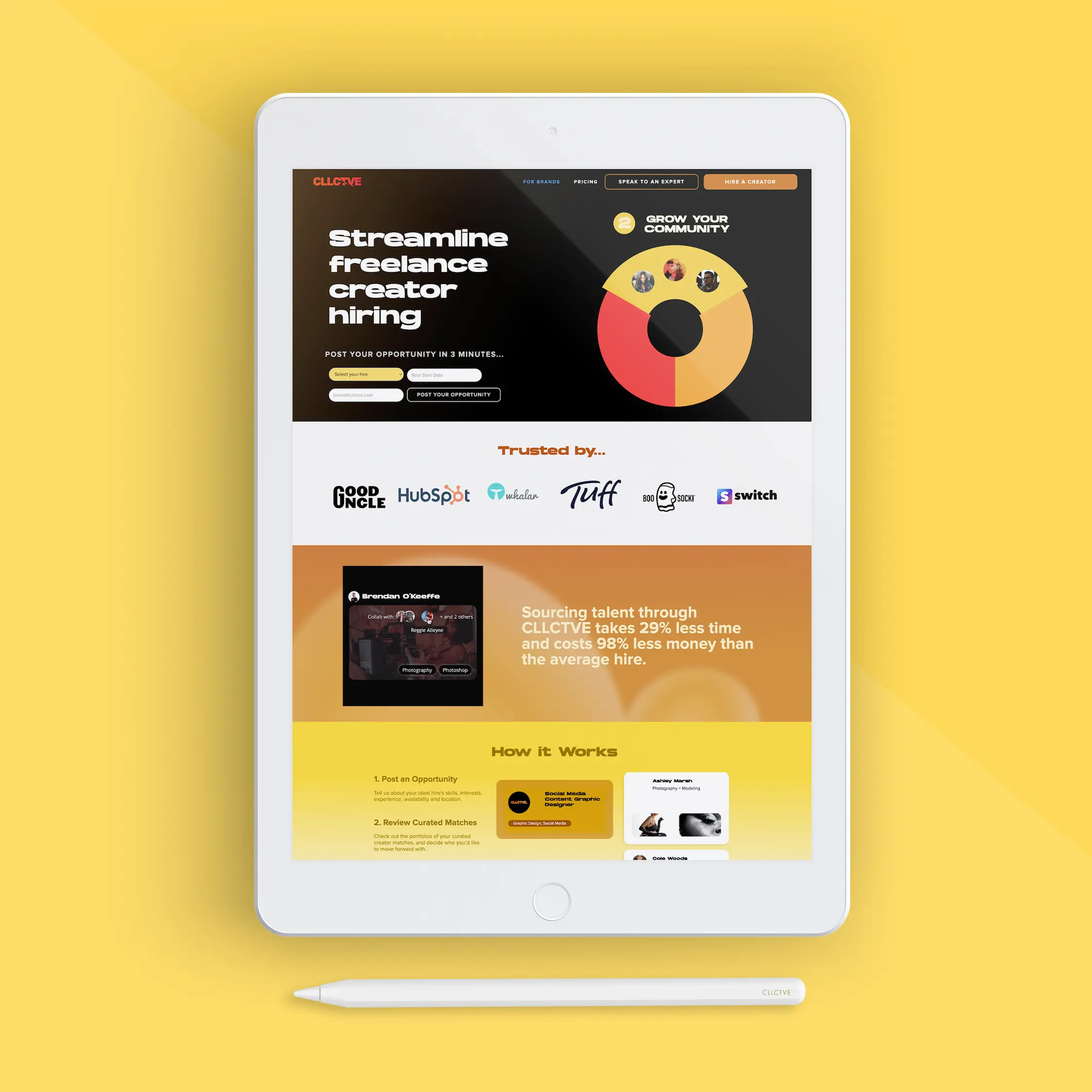
CLLCTVE is a visual portfolio platform designed for all creators. Artists, designers, musicians, writers, etc. can create personalized profiles that showcases what they do and more importantly, who they are. This project was a new initiative to intensify outreach towards brand partnerships through a desktop and tablet-focused landing page.
CLLCTVE for Brands is a curated brand-creator matching service. Brands post new job opportunities, and CLLCTVE will not only reach out to creators who have fitting skills and interests, but will also organize a curated list of applicants and their portfolios to present directly to the brand.
As CLLCTVE's Content Creator, I began by brainstorming what we wanted this page to illustrate, then created the wireframes, and then designed the final product in Webflow.
01. Project Goal
We began the process by brainstorming what facts and functions we wanted to depict. Not only did this page need to explain to brands what CLLCTVE could offer, but also proof that we had been successful before. We came up with the following:
- Immediate access to getting started
- Step-by-step of the matching process
- Testimonials
- Existing partnerships
- Examples of our creators
02. Lo-Fi Wireframes
I began by creating lo-fi mockups to decide where to put each of the bullet points we had previously brainstormed.
The mock-up on the left is the first iteration, while the second iteration on the right goes more in depth with potential color choices.


03. Hi-Fi Mock-up Analysis
After the wireframes were approved, our team worked on gathering all the assets necessary to first make a hi-fi mock-up, where we could make sure they were all visually effective and cohesive.
I created the main flywheel graphic in Adobe AfterAffects, explored our existing platform to decide which creators to showcase, while our Marketing Lead communicated with an existing partner to get their testimonial and our Content Manager sourced articles for us to feature.
Below is my final section-by-section analysis of the brand landing page's final appearance, with notes on each section's purpose, to explain why we decided to proceed with these design decisions.
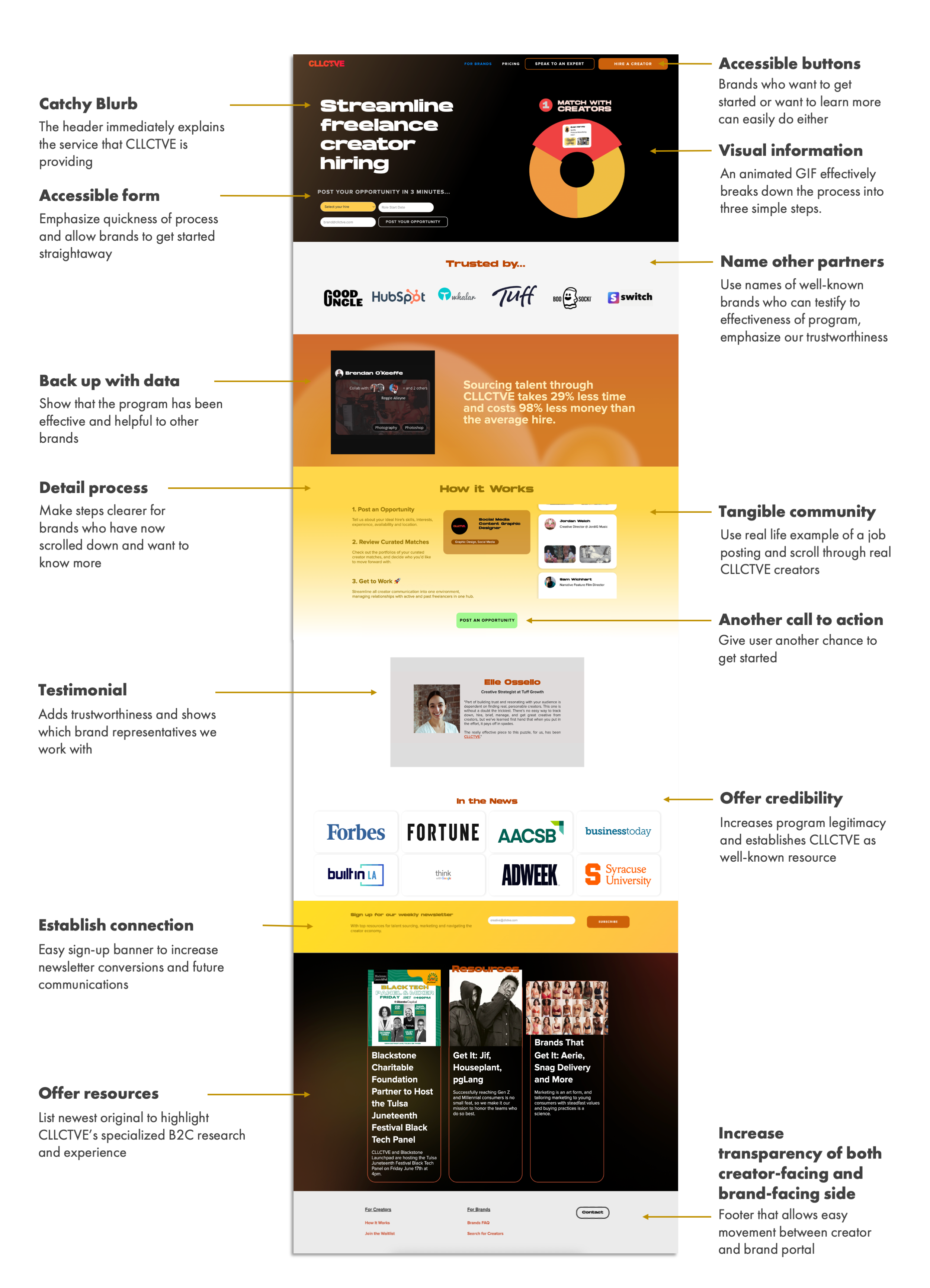
* This website has gone through another re-design since this case study was created. The screenshots on this page may not be identical to what is seen in a live preview.
Other Projects
✕
