ReUSE, which stands for for Re–Used Stuff Emporium, is UC Berkeley’s student-run campus thrift store. This student organization runs the store in MLK Student Union, as well as several stations around campus where students, staff and faculty can easily take free items and bring their own reusable materials to donate.
This 2019 project was an overhaul of the entire brand aesthetic and website.
01. Original Branding
The Problem: Inconsistency. ReUSE originally had two logos, in different styles and with different color schemes. Due to this, ReUSE did not know when to use which logo, and customers would be unsure if both logos referred to the same student organization.

02. First Drafts
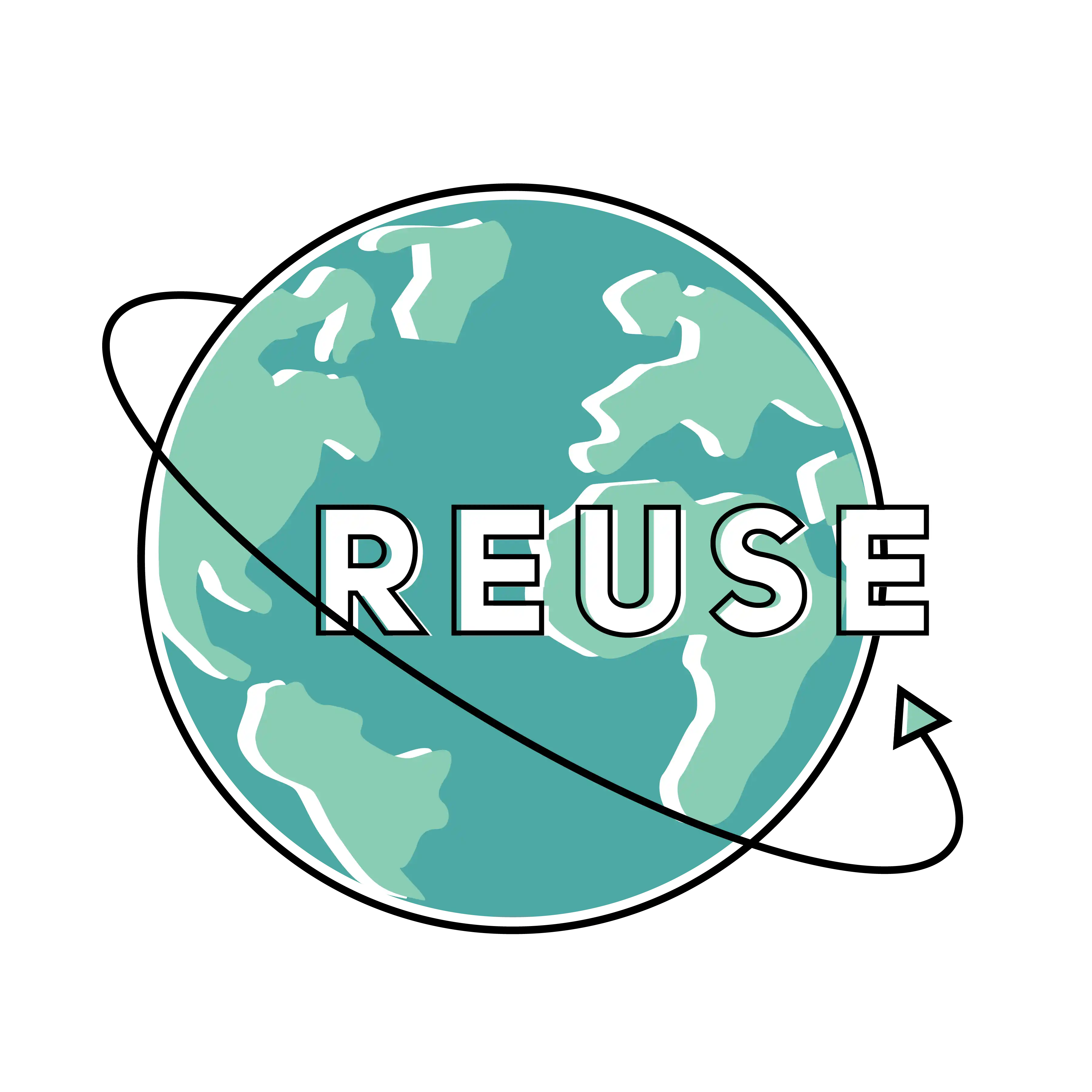
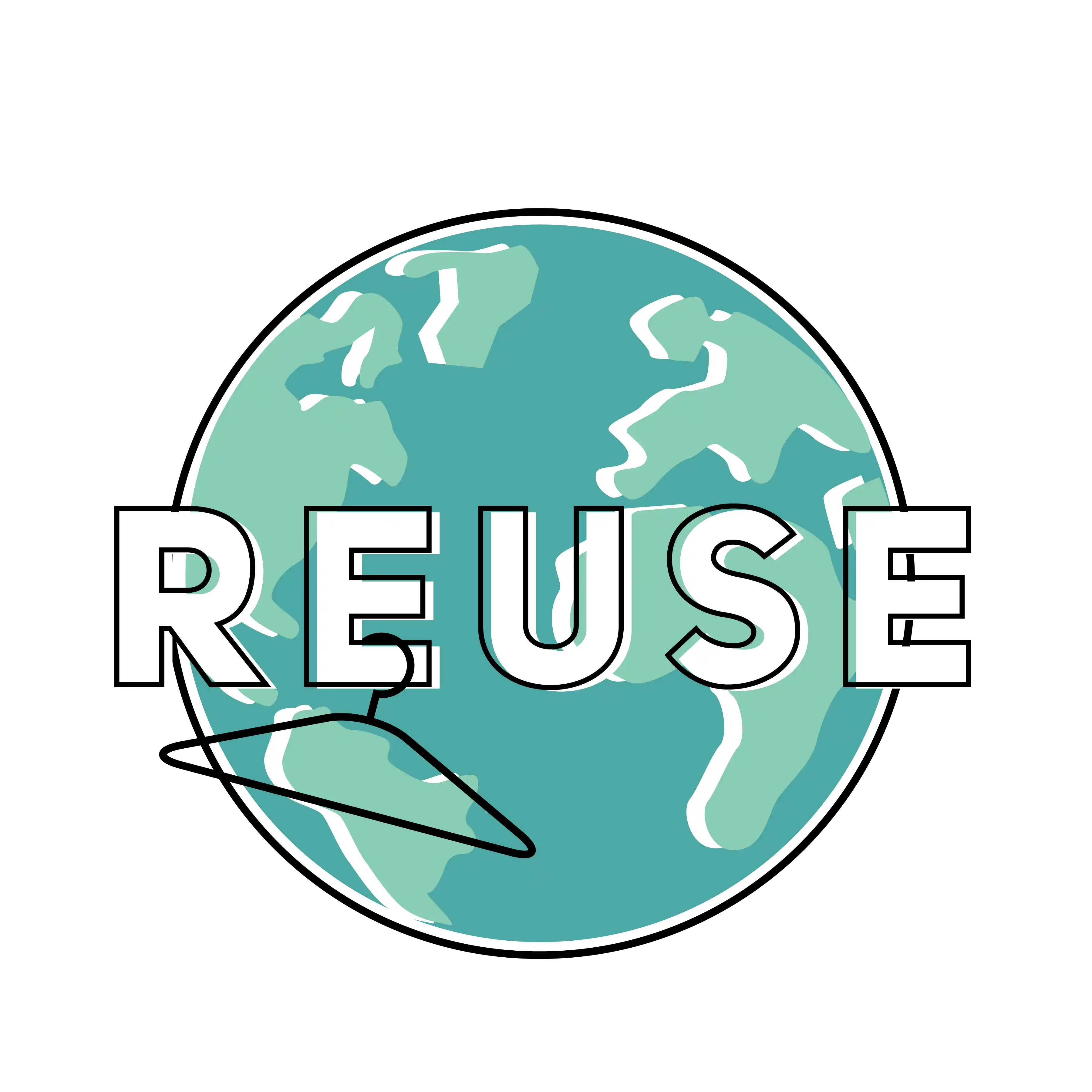
In the first round of logo drafts, I focused on three things:
- A lighthearted, brighter color palette that we could use consistently in all future branded materials
- A clean design style that was more modern and
- A logo with clearer visual symbols to describe what ReUSE is.
After these designs were submitted, they were voted on by ReUSE volunteers and edited based on their feedback.


03. Final Design
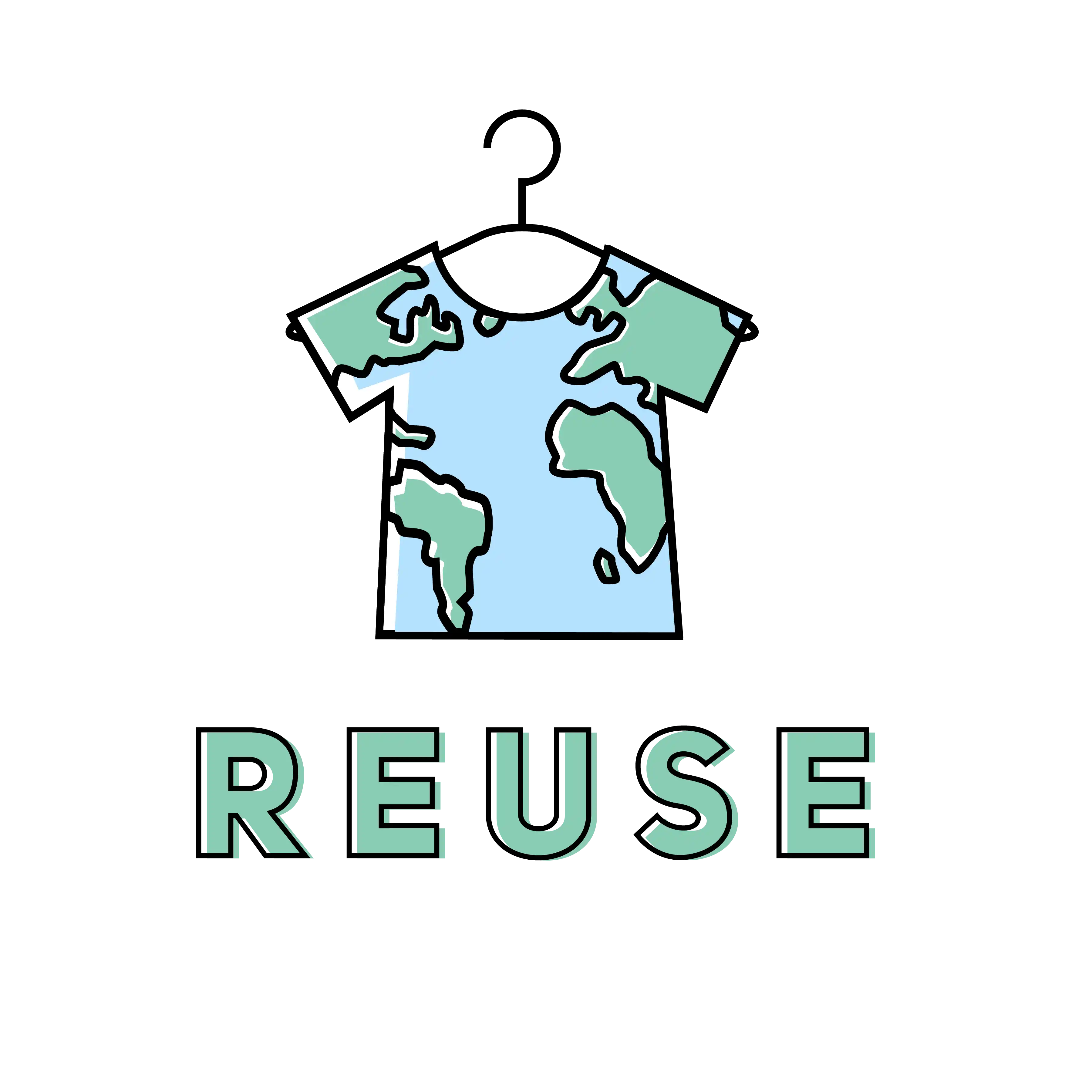
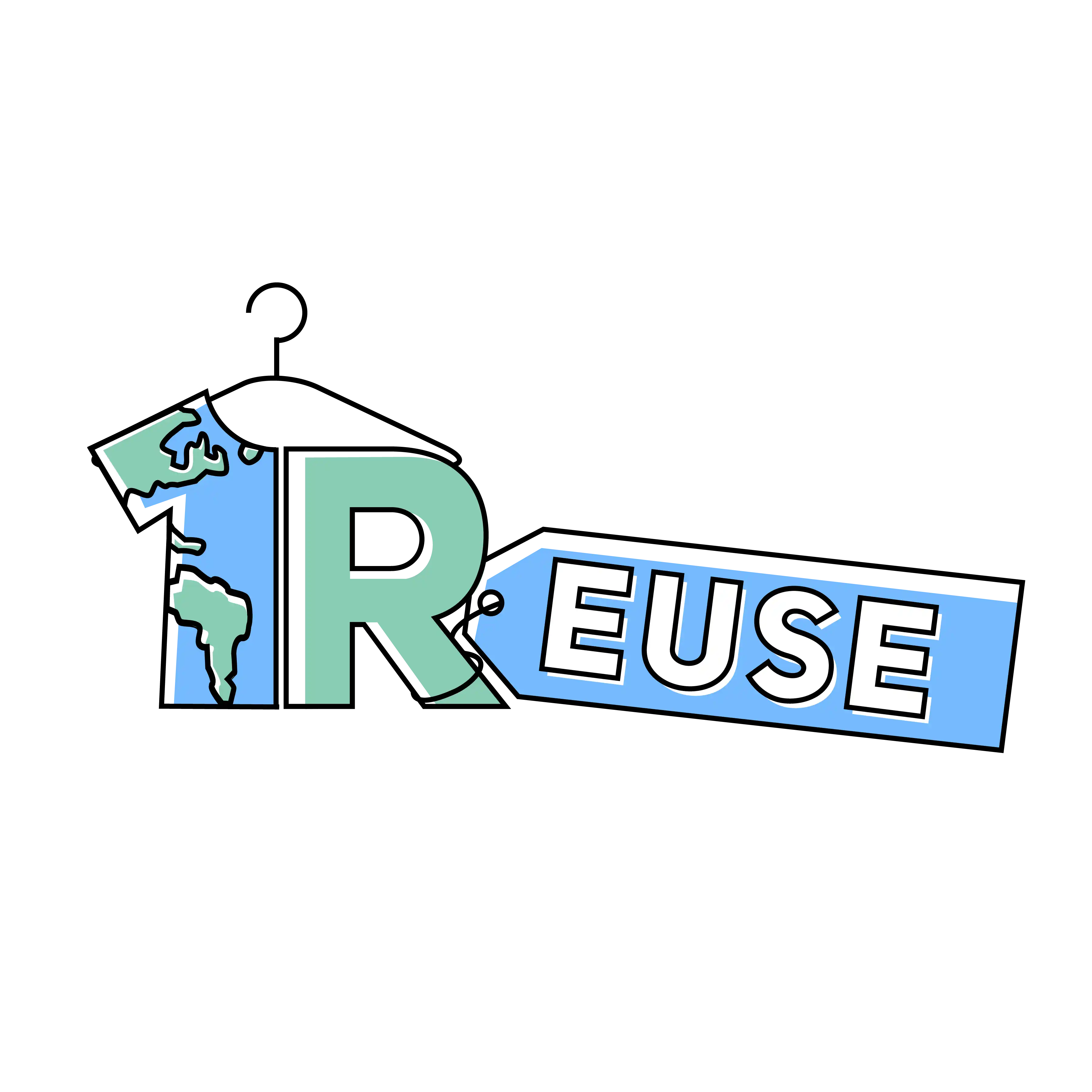
The final design combined multiple elements from previous iterations and also cleaned up the edges based on received feedback.

04. Website Implementation
After being finalized, the logo was implemented into all future branded materials: the (redesigned) website, social profiles and posts, printed flyers, and store signs.

