The Risk Resilience Research Lab at UC Berkeley aims to improve justice, safety and well-being for people and communities at risk, through policy-relevant research and partnerships with government and non-profit stakeholders, including the people they serve, to develop evidence-based strategies.
This project's goal was to first redesign the logo, and then the website, making both more modern and intuitive. As the Digital Communicator, I brainstormed how we wanted to reorganize the lab's information, created the mock-ups, and implemented the final product with Elementor in Wordpress.
01. Original Branding
The first step was to create a new logo for the lab. The client had two main issues with the original logo (shown below):
- The techno-like font and dull color palette had both become outdated, making the lab look austere and incompatible with the modern technology the lab claims to value.
- The circle design provided no additional visual information as to what the lab was actually doing, and its vagueness made it difficult to recognize and remember.
02. First Drafts
For its new logo, the lab directors wanted more positive and hopeful colors, a modern font, and an icon that was more understandable and representative of the lab's mission.
Other than that, I was granted a lot of creative freedom, so the first step was to experiment with different colors and various iconography. I presented a few different variations to start.
The first set was an exploration of different symbols for the lab:
- Brain and neuron network, to symbolize research and intelligence
- Heart, to symbolize care
- Light bulb, to symbolize innovation and ideation
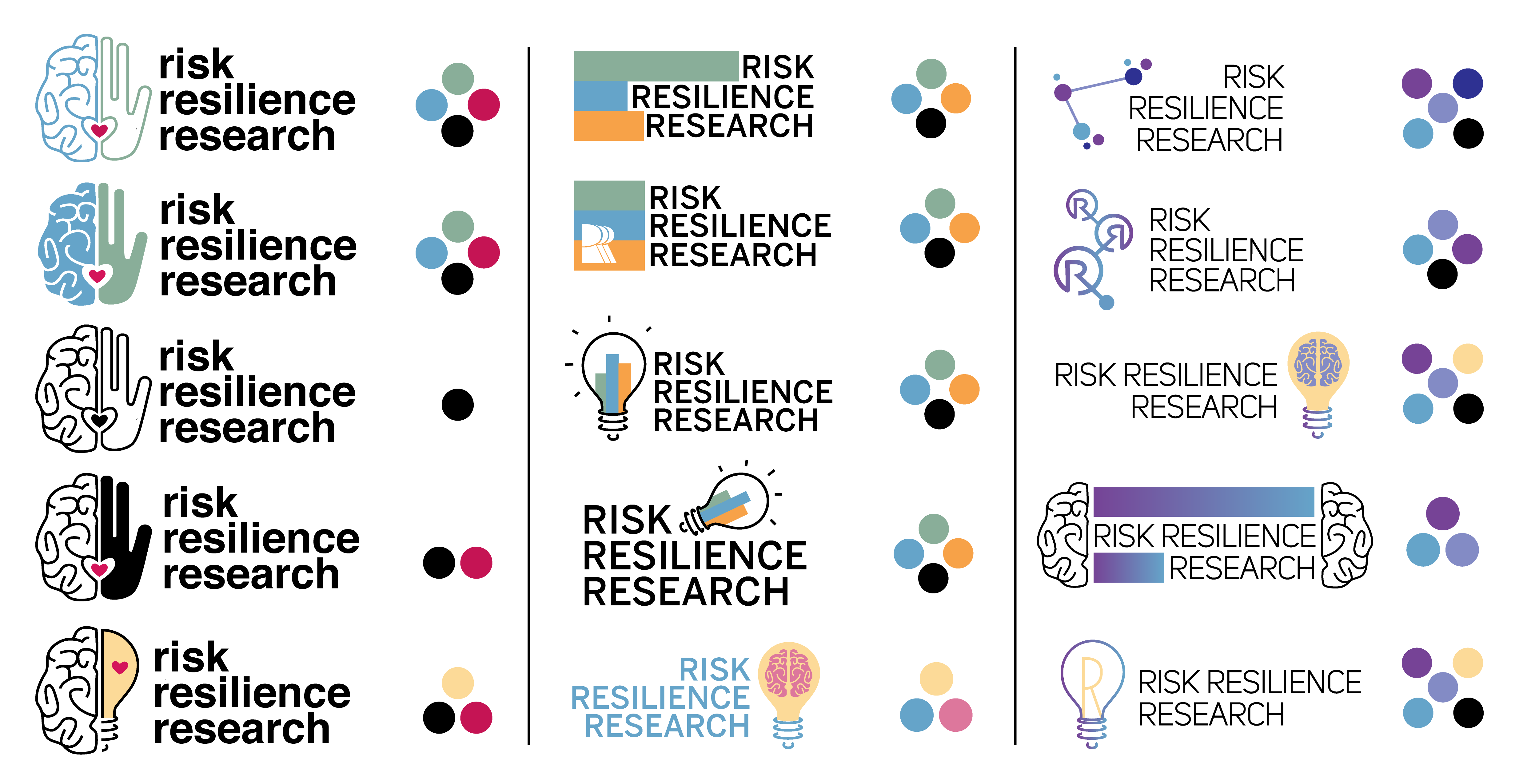
The second set was a continuation of the neural network logo that focused more on different color variations.
The client also wanted to alter an alternate logo that had been recently created by an outsourced freelancer into one of their better-liked color combinations.
After viewing all the drafts, the client mentioned liking the light bulb symbol but also liking the style of the freelancer’s logo. I designed some hybrid logos in different colors, emulating some visual aspects of the original.
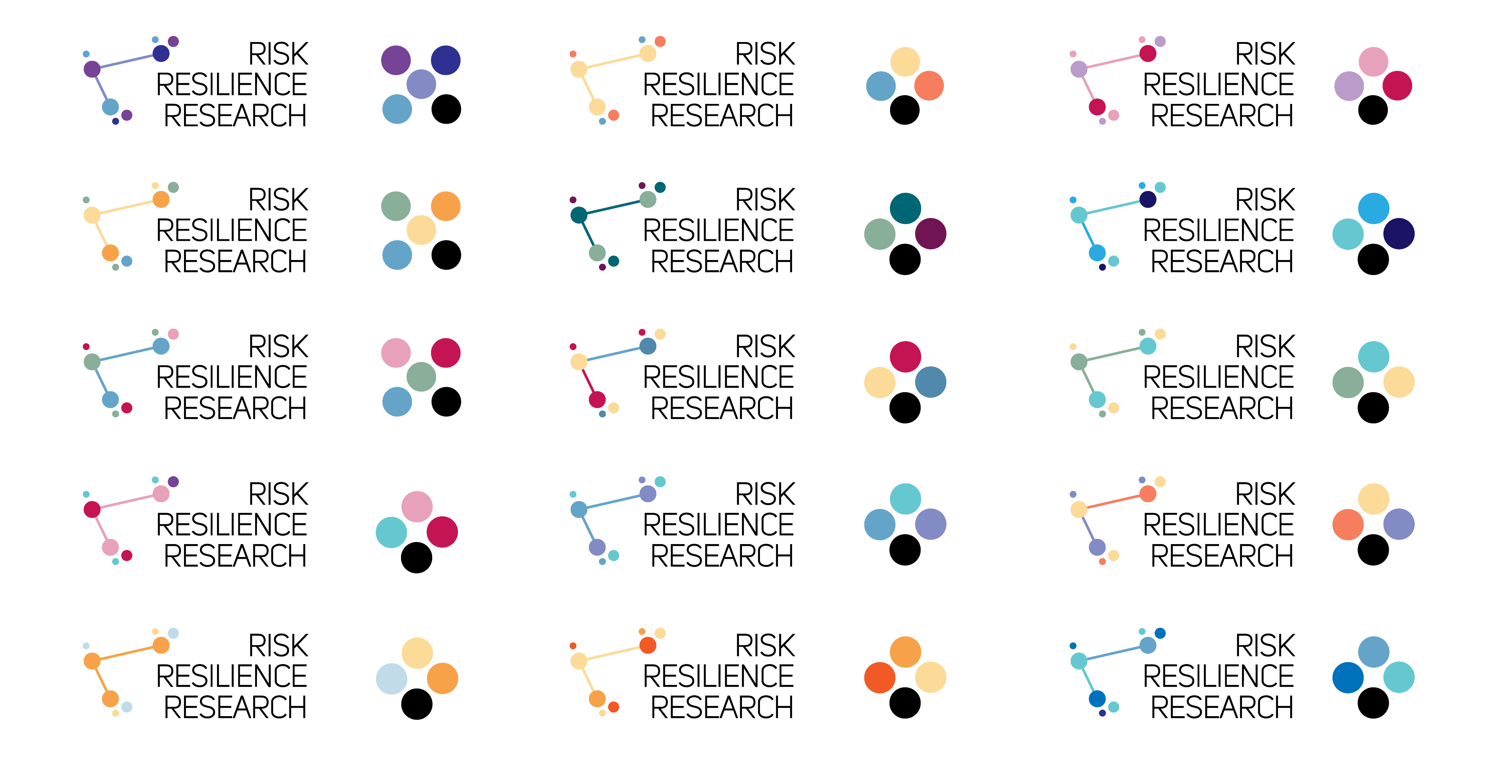
03. Second Drafts
Still finding the original light bulb and bar graph visual the most appealing, we turned our attention to different angle and color variations for our next round of In the end, the client preferred one of the original designs, so in second drafts I worked on experimenting with different layouts of the light bulb symbol, as well as testing out different color variations and logo texts.
04. Final Design
Our favorite iterations were sent out to all the lab members for feedback. After deciding on the final logo, a branding kit was created, along with other assets such as headers and backgrounds for social media and Zoom, given that we were in the middle of the pandemic. The logo was also implemented in other forms, as letterheads, profile photos, thumbnails, stack mastheads, etc.
05. Original Website
Now that the new logo and color scheme was confirmed, we began planning how to implement it into a new website. The first step was to go through the current website and analyze pitfalls in the user experience.
We noted the following:
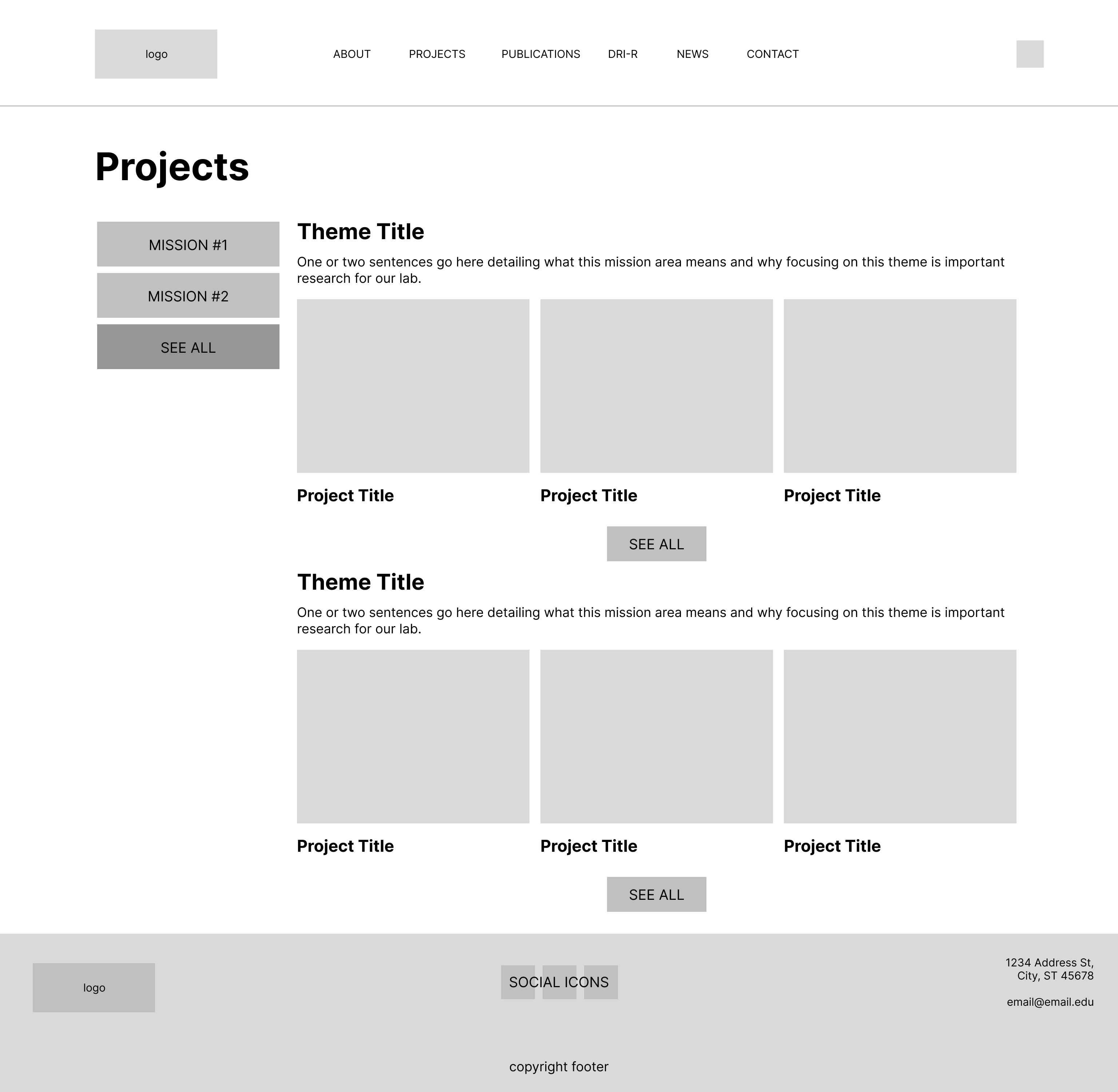
- Individual research projects were only accessible through the navigation menu; without already knowing what they were looking for, new users could not easily get an overview of the lab's work. Users could also not easily navigate between projects.
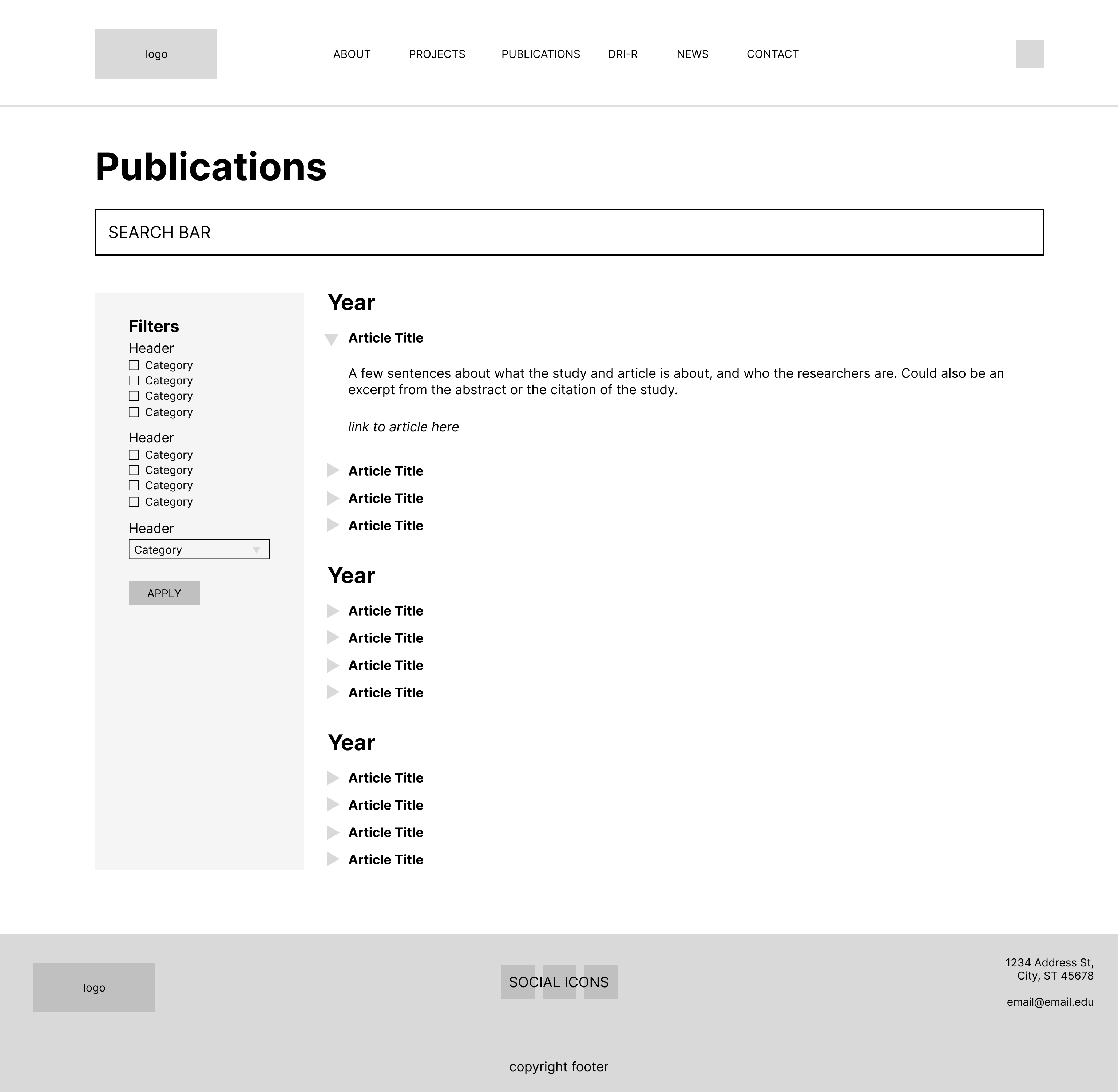
- Similarly, publications were sorted into categories that were too specific or they were not categorized at all, making them difficult to find.
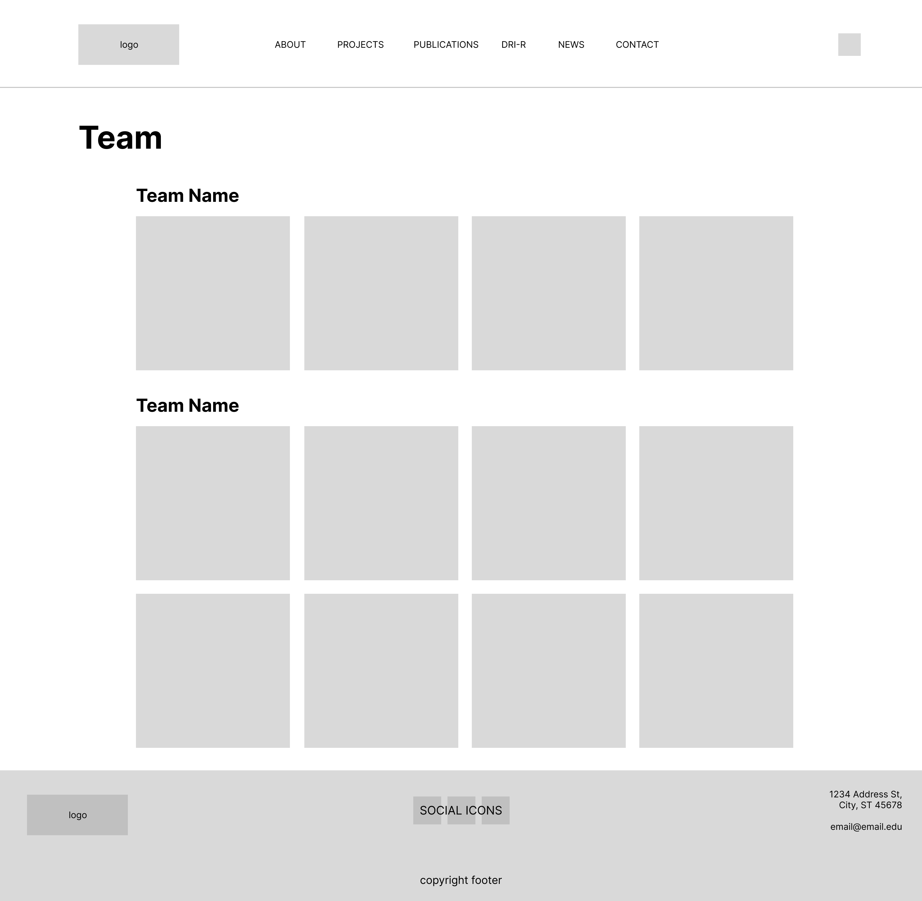
- Team members were similarly hyper-categorized by education level and position (staff, post-doc, doctoral, student research assistants, etc.), information that was neither useful to or even known by site visitors.
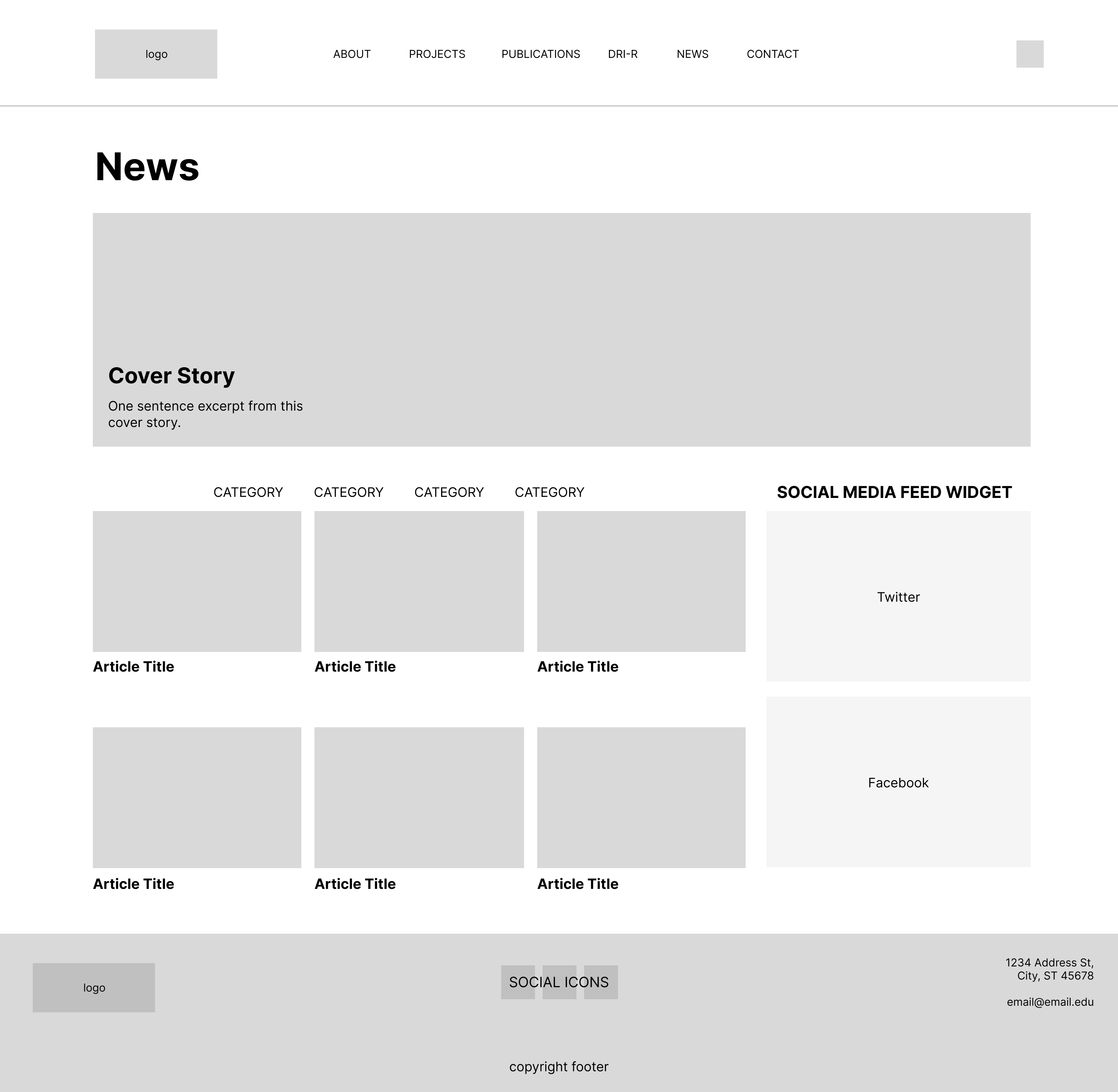
- On all these pages, there was also simply too much unnecessary text, such as team member introductions and news article excerpts.
With this analysis, we landed on three main focus areas for our website redesign:
- Unite the website under the new branding kit.
- Find an intuitive way to organize projects, publications, members, and other information.
- Add more links on each page to create a more interconnected user flow.
06. Lo-Fi Wireframes
With our goals in mind, we began with remaking the following pages into lo-fi wireframes, with the main changes being a centralized page for publications and projects.
07. Final Design Analysis
Afterwards, we worked with all the staff in the lab to gather more specific information for us to input into hi-fi mock-ups, emphasizing certain key elements, some of which are labeled below.
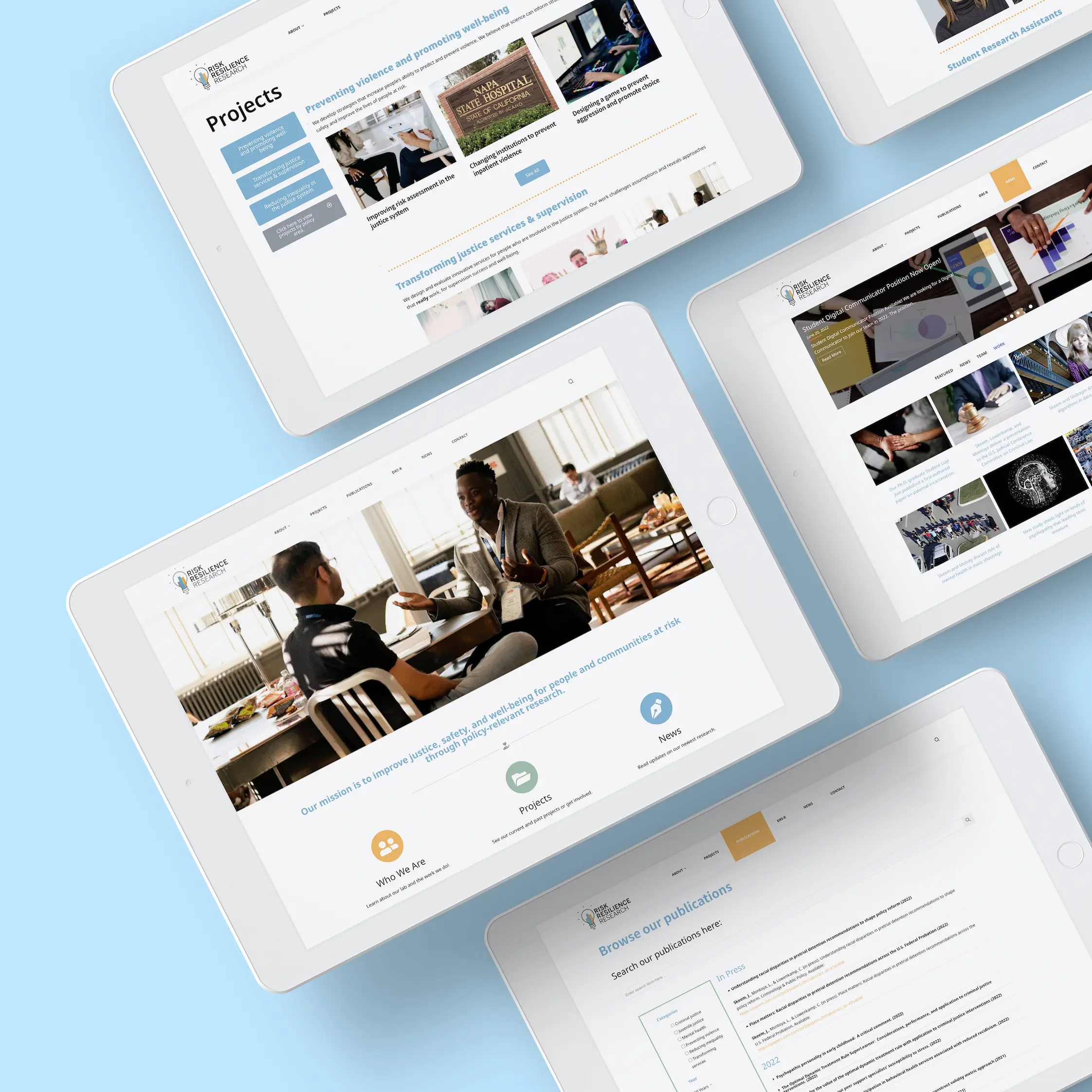
08. Implementation*
We proceeded to implement our mock-ups through Wordpress, using WPBakery Builder and additional CSS. Here are the final highlights of our redesign:
Homepage: The addition of a hero page and one very visible mission statement.
Team: We consolidated all members into one page, with bios showing up as modals and more accessible contact information for each person.
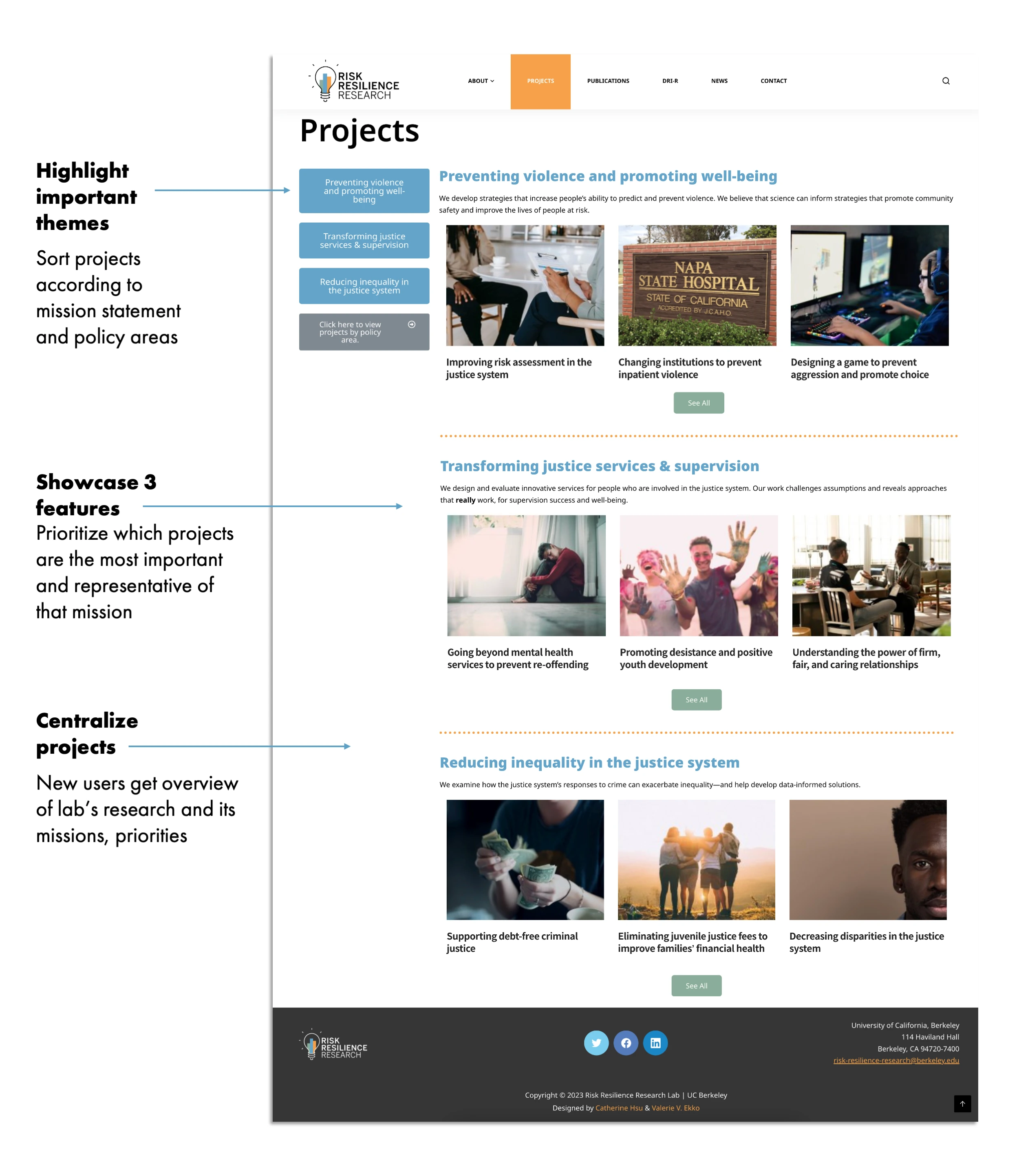
Projects: The most important part of the projects section was the creation of a centralized page with featured projects from each mission area and policy area.
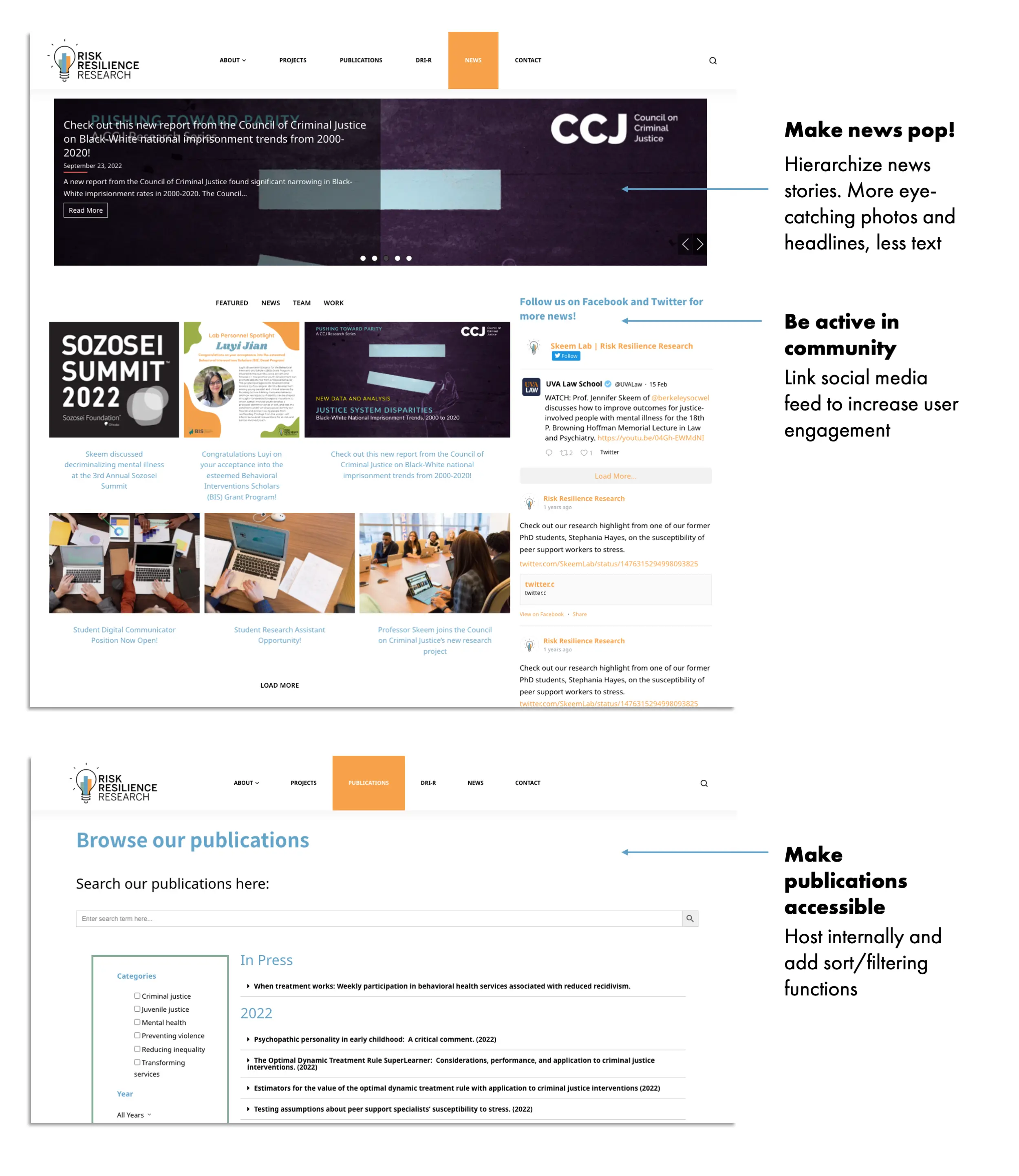
Publications: We also consolidated the publications and publications search page into one page, sorted by year, and clarified the categories.
News: For the news page, we focused on making it more image-focused, lessened the amount of text to draw attention to headlines instead, and integrated our social media feeds into the page.
After our new website went online, we tested it with different sets of users to ensure that we reached our three main goals, as mentioned earlier:
- Uniting the website under the new branding kit. ✅
- Finding an intuitive way to organize projects, publications, members, and other information. ✅
- Adding more links on each page to create a more interconnected user flow. ✅
* This website has gone through further updates since this case study was created. The screenshots on this page may not be identical to what is seen in a live preview.
Other Projects
✕
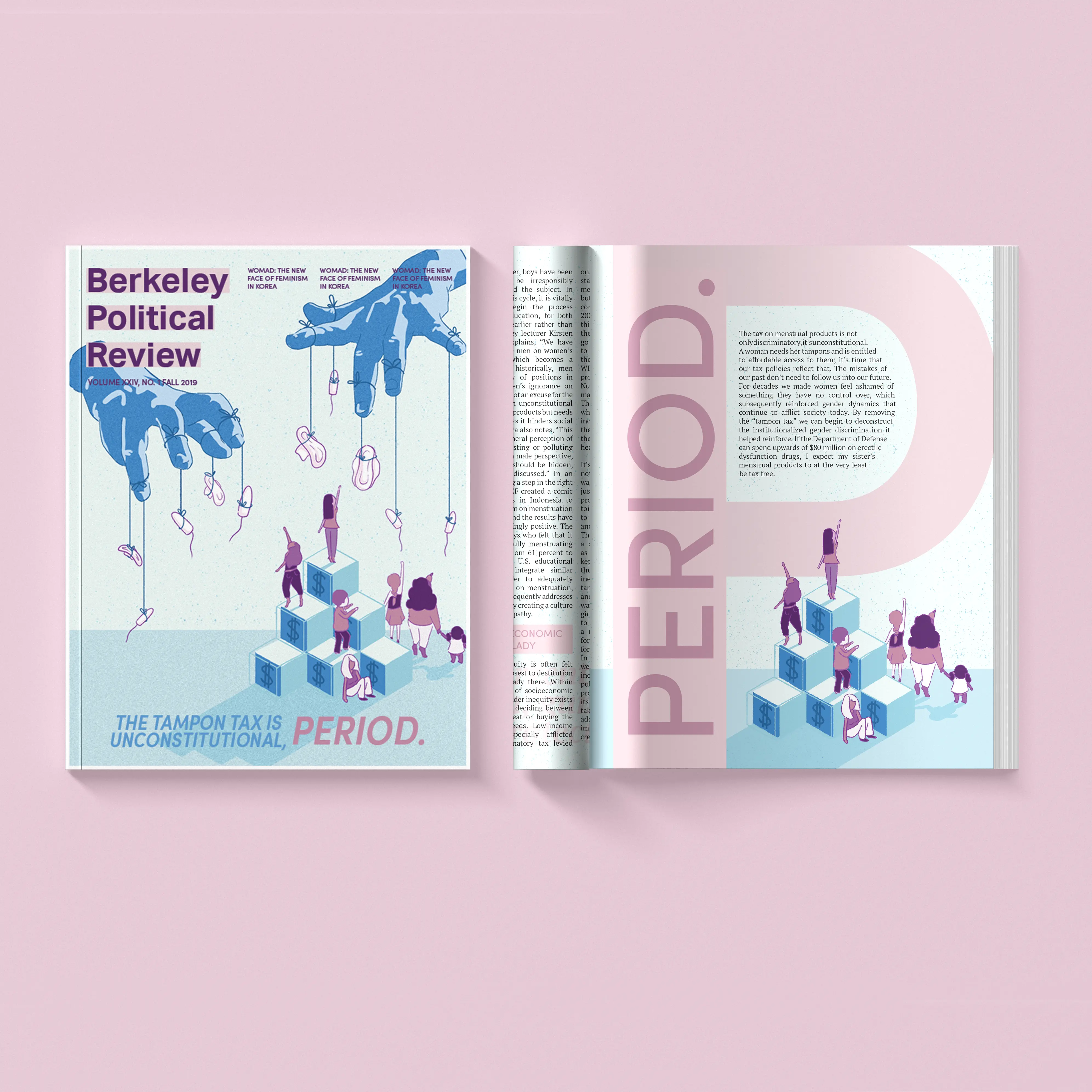
The Tampon Tax Is Unconstitutional, Period.
2019 — Photoshop, InDesign
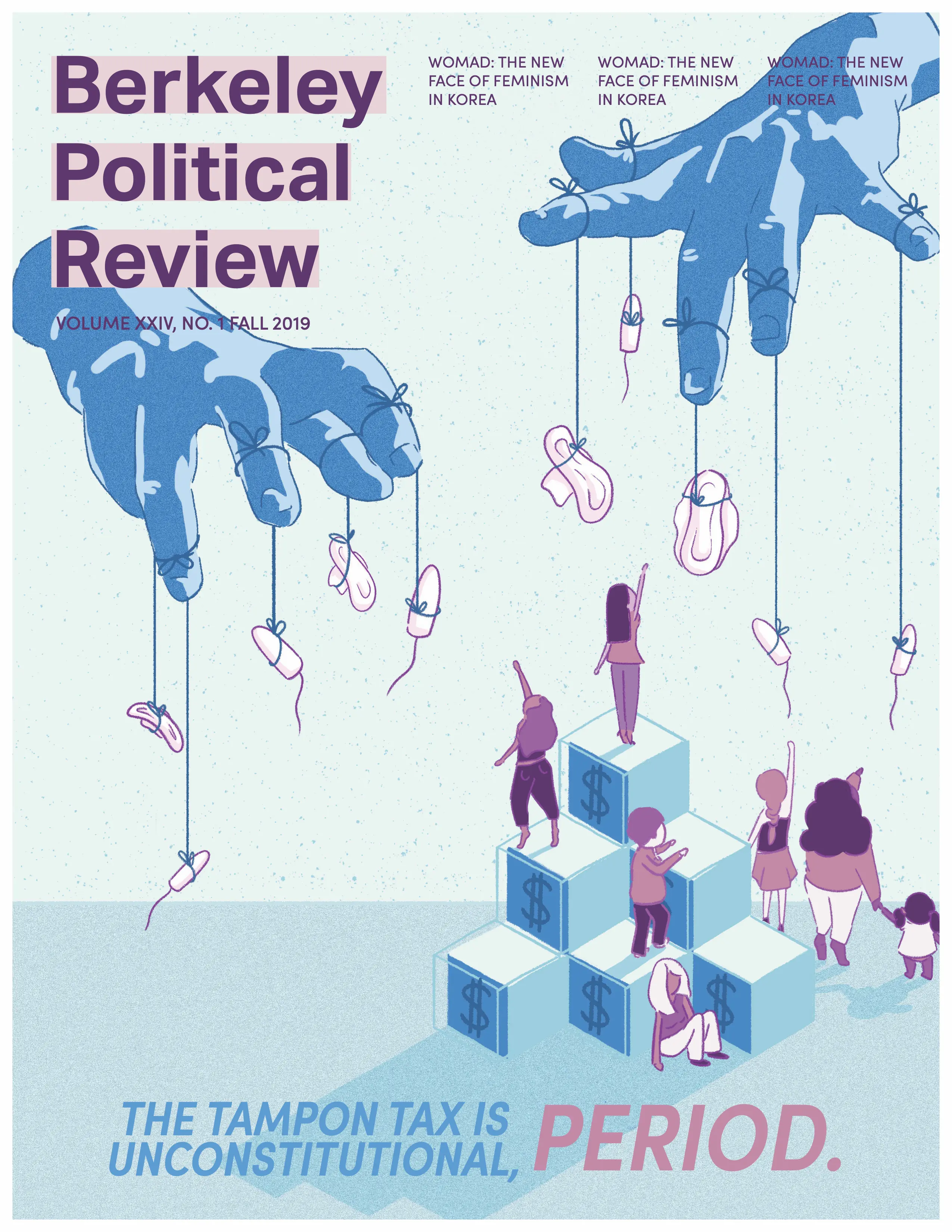
“If the Department of Defense can spend upwards of $80 million on erectile dysfunction drugs, I expect my sister’s menstrual products to at the very least be tax free.”
For this issue of Berkeley Political Review, I wanted to make a cover that told a story. Working with the article author and researching political cartoons and visual metaphors, I illustrated an image of pads and tampons being held out of reach, with stairs to represent financial ability.
In addition to the cover art, I was also responsible for several design spreads. The following articles and pages are my work:
- Cover Art & Pg. 32:The Tampon Tax is Unconstitutional, Period.
- Pg. 12: Obamacare Wasn’t Enough — We Need Medicare For All
- Pg. 58: The Mental State of California’s Prisons